Plank Loves Fonts
Author
Tarah Schwartz
Date
mars 10, 2020
We come across it every day on our laptops, phones and desktops. In the books we read, the magazines we flip through, the billboards we glance up at. Typography. And using it correctly is an art.
Making something as readable and appealing as possible involves myriad choices: from the perfect font, its size, decisions about line lengths and spacing. At Plank, our designers use typography on a daily basis, making sure each site we craft is perfectly suited to the subject, and a pleasure for users.
If typography is done well, all you notice is how effortless it is to browse. It’s the unsung hero of every website. With that in mind, here are some fonts we love, why we love them, from the people who use them most.
Jennifer Lamb, Creative Director
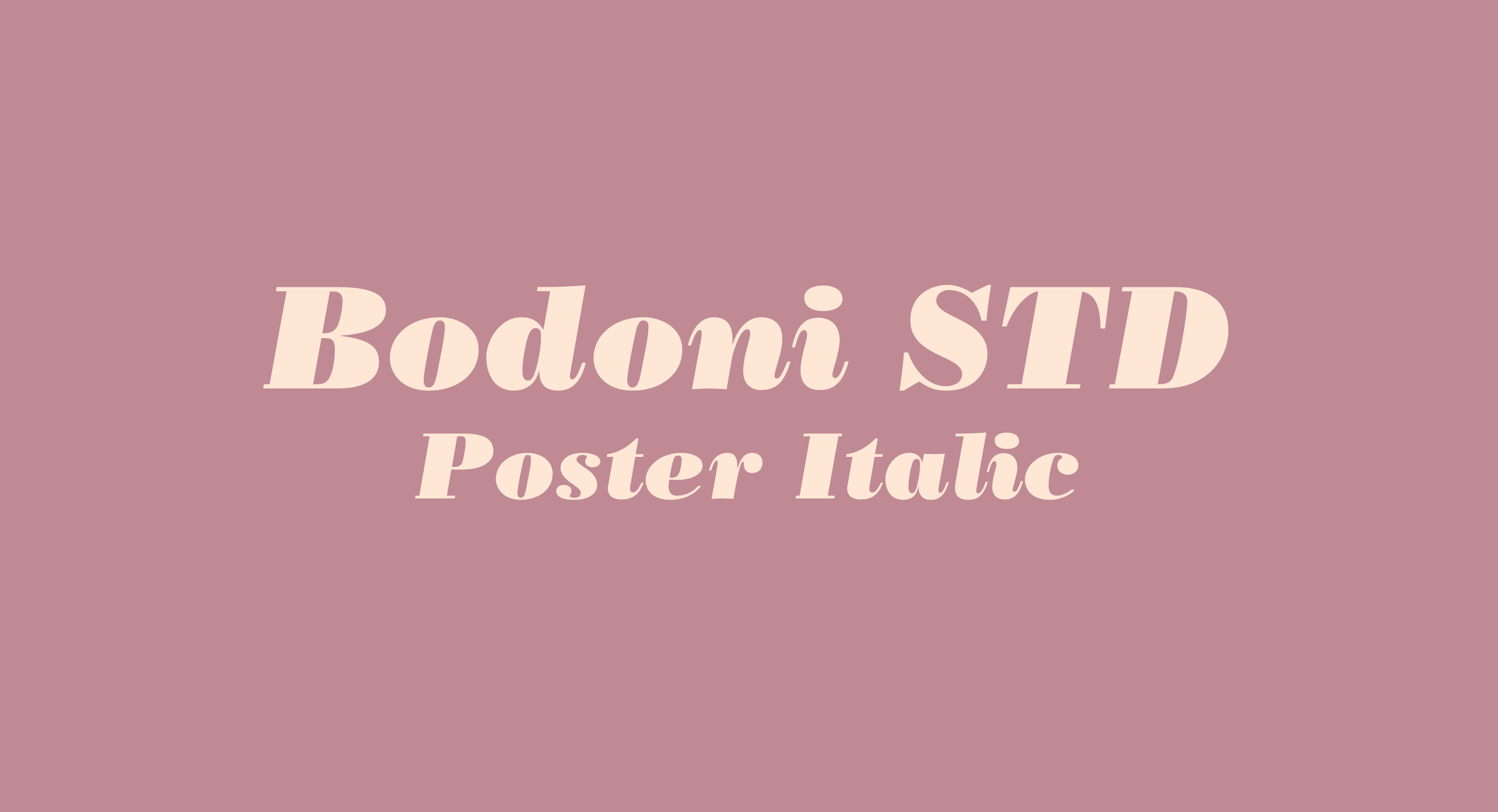
Bodoni STD Poster Italic
My ultimate favourite typeface is not in my top spot for its versatility. Bodoni STD is purely an aesthetic favourite. The lowercase italic f’s are a pure delight!
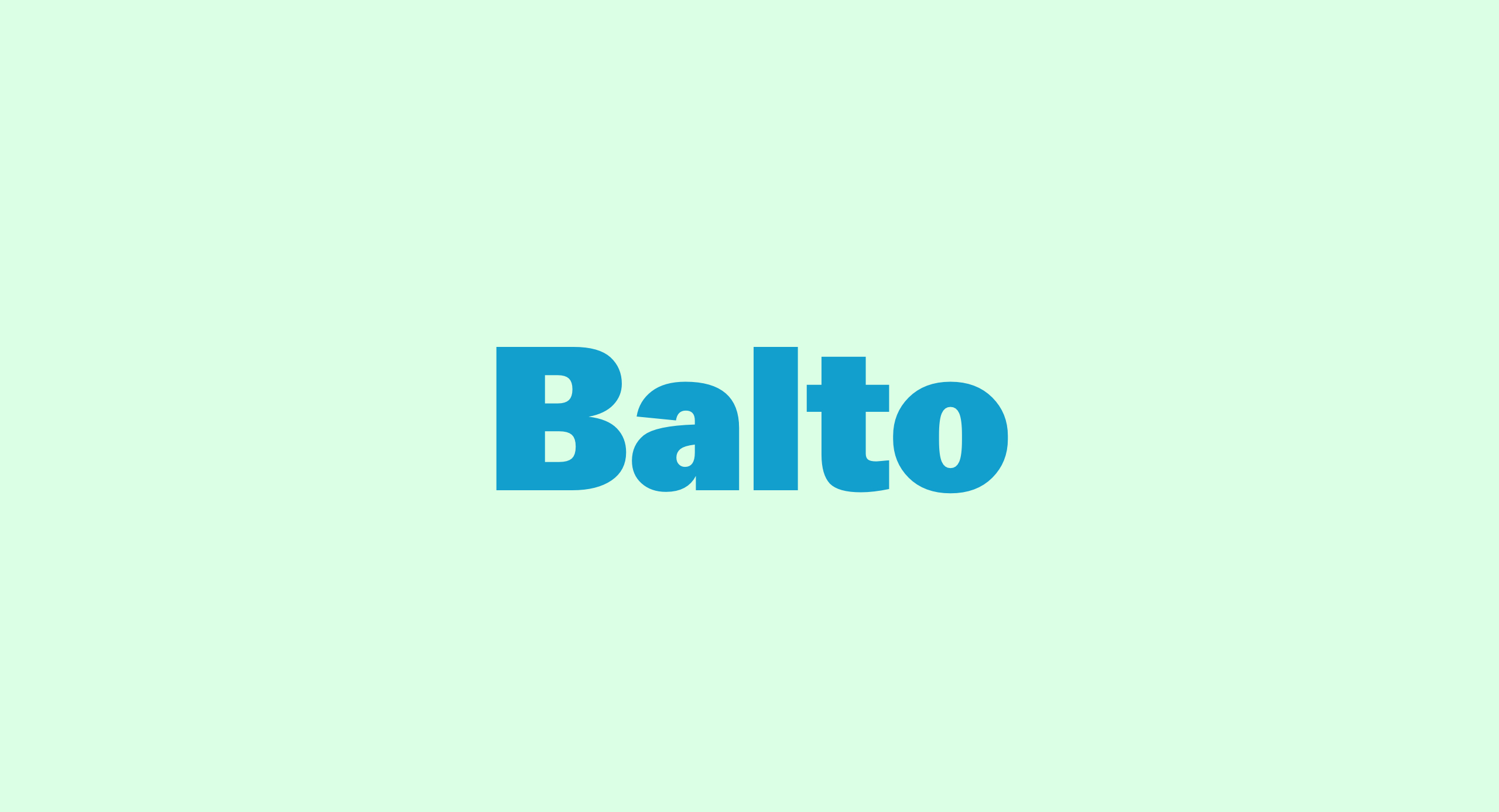
Balto
I’m also really digging Balto, a Humanist Sans typeface, aka « The American Gothic for the 21st century. » I look forward to working with it, often, and for a long time to come.
Sidenote: Check out the Arrows section of the Balto family page. It’s a whole lot of fun.
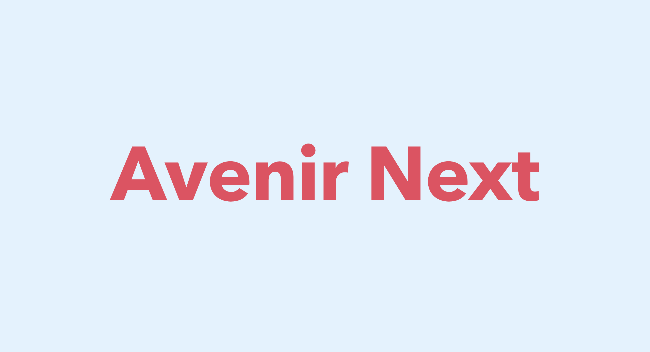
Avenir Next
Avenir Next is a beautiful Geometric Sans with a Humanist vibe and a wide array of variants. It looks great on screen and is one of the most readable typefaces I’ve ever come across at small sizes, which explains why LG adopted it for the buttons on its cell phone.
Steve Bissonnette, Managing Partner
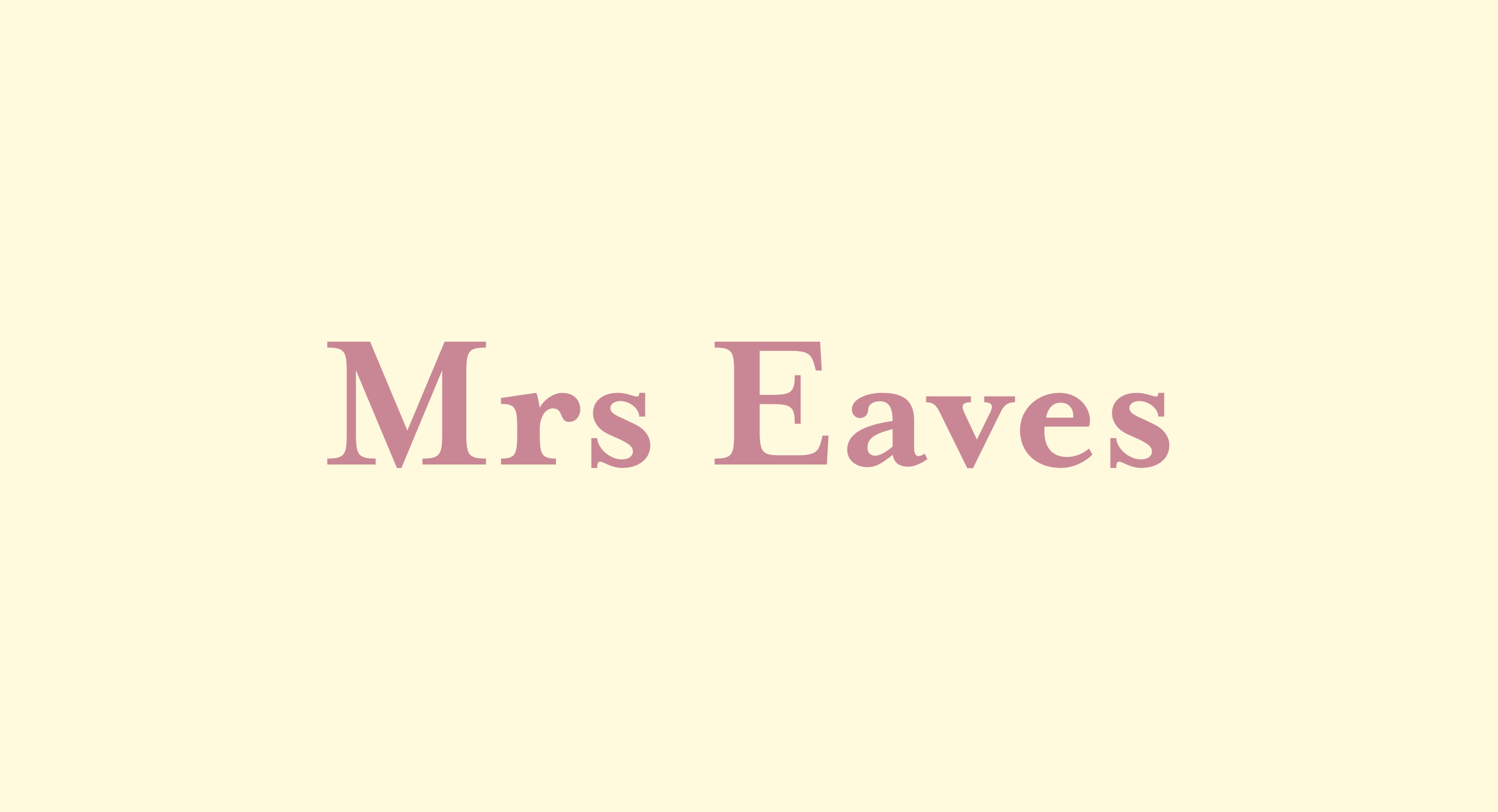
Mrs Eaves
My top font pick is a non-standard one. The way the “zy » in the italic fits together alone makes me smile. It’s got a classic, easy to read feel and diverse family. The small caps are sublime — especially the Q. Let’s not even get started on the ligatures.
Véronique Pelletier, Interactive Designer
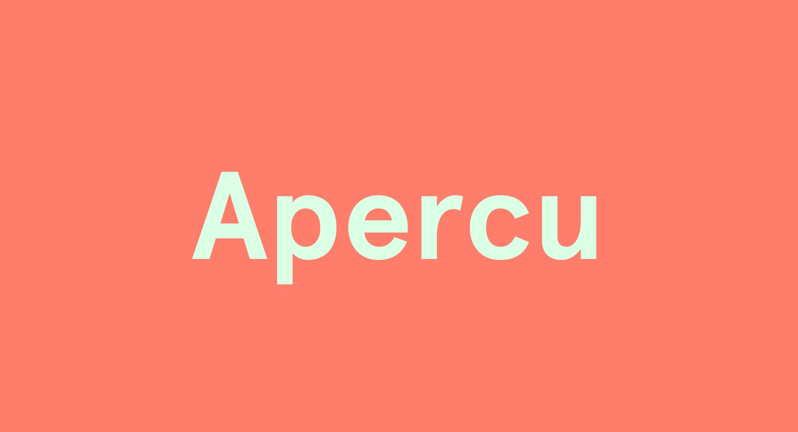
Apercu
Apercu is a grotesque sans-serif font that was released in 2010. I like it because it’s versatile, comes in a variety of weights and styles. I also like it because it’s quirky, it has a fun playful side to it that other sans-serif fonts don’t have.
Christina Garofalo, Backend Developer
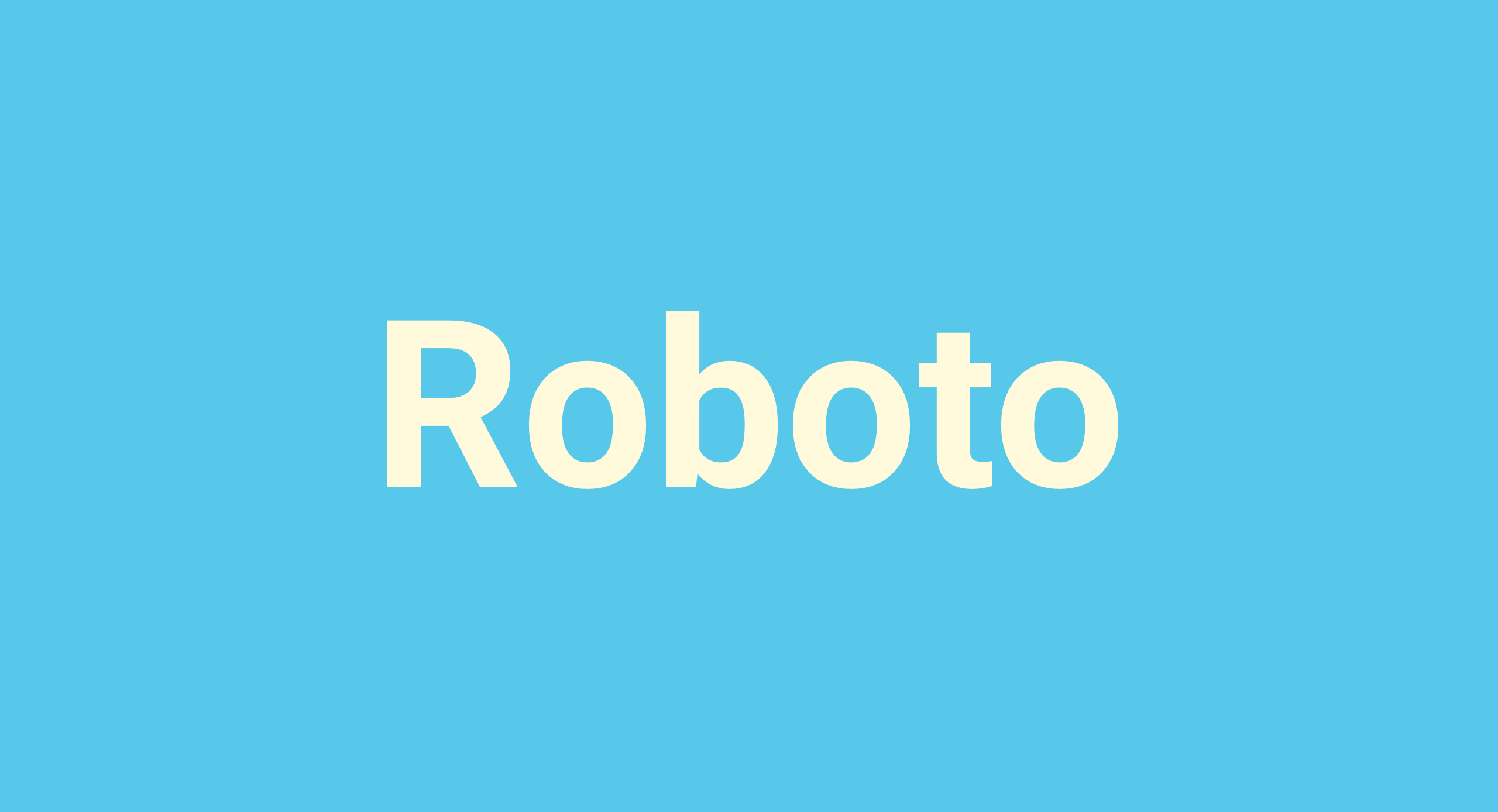
Roboto
I love this typeface for body text, in both print and web. I like Roboto because it is open source, has Helvetica vibes without being Helvetica. It’s clean, easy to read, and has a full range of weights for variation. For a simple font, it’s fun to design with.
Added bonus: My favorite font site is Font Squirrel. It’s free for commercial use!
Megan McEwan, Front-end Developer
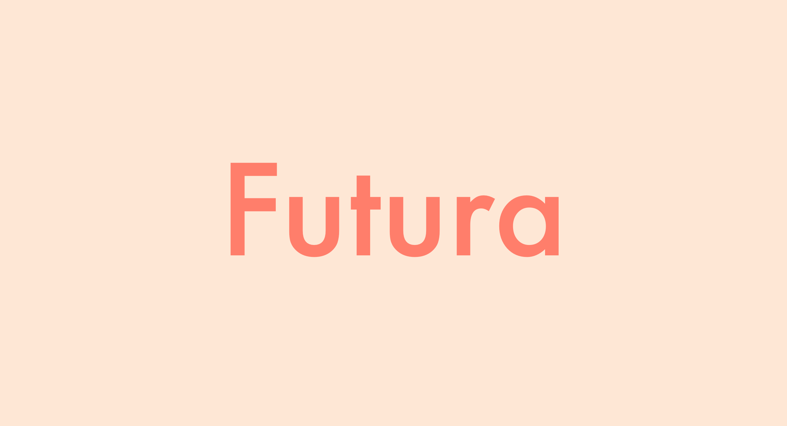
Futura
Sans-serif typefaces often feel modern and are generally considered well suited for the web. As someone who loves modernity and spends a lot of time looking at screens, I almost always prefer them to serif typefaces. Futura is a particularly special one in my mind. Released in 1927 and featuring clean, geometric lines, it is both classic and modern at the same time. Simple yet full of personality, it has a way of feeling retro-futuristic which is a design aesthetic that I find endlessly intriguing.
Massimo Triassi, Backend Developer
Lemon Milk
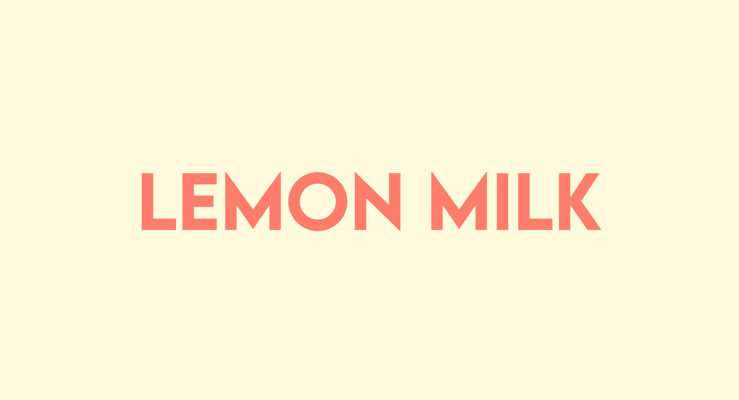
Lemon Milk is my favourite for a number of reasons; firstly it’s really angular and sharp, giving it a futuristic look. Secondly, it’s the first font I used as a brand font for the Robotics competition run by CRC Robotics, so in that regard it holds some sentimental value to me. Lastly, it helps that it’s free to use for non-profit purposes.
