5 Elements of Responsive Web Design
Author
Stephanie Beasse
Date
March 1, 2021

Responsive design started making waves around 2010 when Ethan Marcotte published his first blog post on the topic called Responsive Web Design. Since then, it has become a foundational practice for web designers. Although a standard practice that’s over a decade old, responsive design continues to evolve.
This is our way forward. Rather than tailoring disconnected designs to each of an ever-increasing number of web devices, we can treat them as facets of the same experience.
Ethan Marcotte, via A List Apart
Responsive design is what allows developers to create an equal user experience regardless of the device being used. Instead of creating completely different websites for each device, the site is developed to adapt automatically to a user’s screen, allowing us to keep up with the ever-increasing number of devices.
What is Responsive Design?

Simply put, responsive design is a flexible way for a design layout to adapt to different device sizes and types. Not only are screen sizes different, so is the overall experience. On a desktop, you could be using a mouse, with a laptop a trackpad, and on mobile your touchscreen. A web designer’s goal is to ensure a comparable experience across all devices.
What does that look like? Well, there are a ton of different elements that go into responsive design. It’s a menu header turning into an expandable menu. It looks like four columns turning into one. It could also be side columns disappearing on smaller screens. All of these lead to an equally suitable experience across mobile and desktop.
Mobile-First Design
A big component of a successful website is using mobile-first design, also known as content-first design. Mobile-first ties into responsive design because the content you provide users needs to make sense on mobile and desktop. Since mobile has less space to work with, creating content for the smaller device first forces you to focus on the most crucial information. The alternative would be trying to squeeze the content you created for a desktop into a smaller screen. Not fun, nor fit for purpose.
When you’re mapping out content you need to think about the screen’s real estate and content’s levels of priority. When a user opens your homepage what information are they looking for? If you’re a theatre, they might be looking for tickets to your latest show. If you’re selling software, your user might be looking for a free trial. Each organization will have a different priority list.
Responsive Design and Accessibility
Accessibility is an important part of responsive design because individuals don’t experience the web in the same way. Designers and developers make web pages adaptable so that everyone looking at their screen can experience it in the most suitable way possible. Whether that’s through the optimization of code and assets for those without access to hi-speed internet, or through assistive technology markup data for the visually impaired, or those who simply prefer to navigate using their keyboard.
RELATED: Web Accessibility: 12 Tips for Publishing Inclusive Content
And everyone benefits from accessibility. When the sun causes glare on your screen, when you want to listen to videos without sound, or when you want to send voice messages. These are all examples of accessible design.
Most of the time, creating adaptable websites means thinking of functionality before aesthetics. Animations are cool, but will they work on mobile where hover states aren’t a thing? Will they hinder certain individuals from getting the information they need? These are all the things you need to ask yourself when thinking of responsive, accessible design.
5 Great Examples of Responsive Web Design
1. Content-First Approach
Remember that content-first = mobile-first. This is the most important element of responsive design. With its limited data and screen real estate, mobile naturally demands rigorous prioritization. The benefit of this approach is that you’ll end up with a design that responds to your users’ needs. Mobile-first isn’t always about eliminating information, it’s about setting priorities.
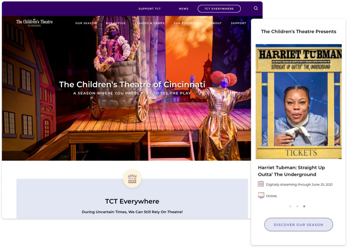
The Children’s Theatre of Cincinnati (TCT)
Using the content-first approach, TCT knows that its core audience is primarily looking for upcoming events and activities. As with many theatre-based companies, they’ve had to adapt to changing demands during a pandemic. Their homepage begins with an announcement of their commitment to continue entertaining audiences through remote videos and activities, followed by a list of streaming events. Instead of simply being stacked, the events on mobile are displayed in a horizontally scrolling carousel, allowing interested visitors to stop and browse. This also reduces the amount of scrolling for secondary audiences, such as donors and educators.
Their next level priorities are:
- Activities (on pause during the pandemic, but useful info for parents preparing for the end of lockdowns);
- Stats that speak to potential donors and educators; and
- News & Sponsors
By using a content-first approach, TCT has a website that speaks directly to its users no matter the device being used.
2. Progressive Enhancements
A content-first approach is the foundation to progressive enhancement. Once you’ve ensured that you have captured and prioritized all essential elements, you can enhance the experience for situations that can handle it, while resting assured that all your users will be able to find what they need. Very closely related to accessibility, progressive enhancement focuses on the content because some individuals won’t see the aesthetic design elements or interactive interfaces on mobile or older browsers. Content is what everyone wants to and can see, which is why it should be the foundation you build from.
RELATED: Understanding Progressive Enhancement
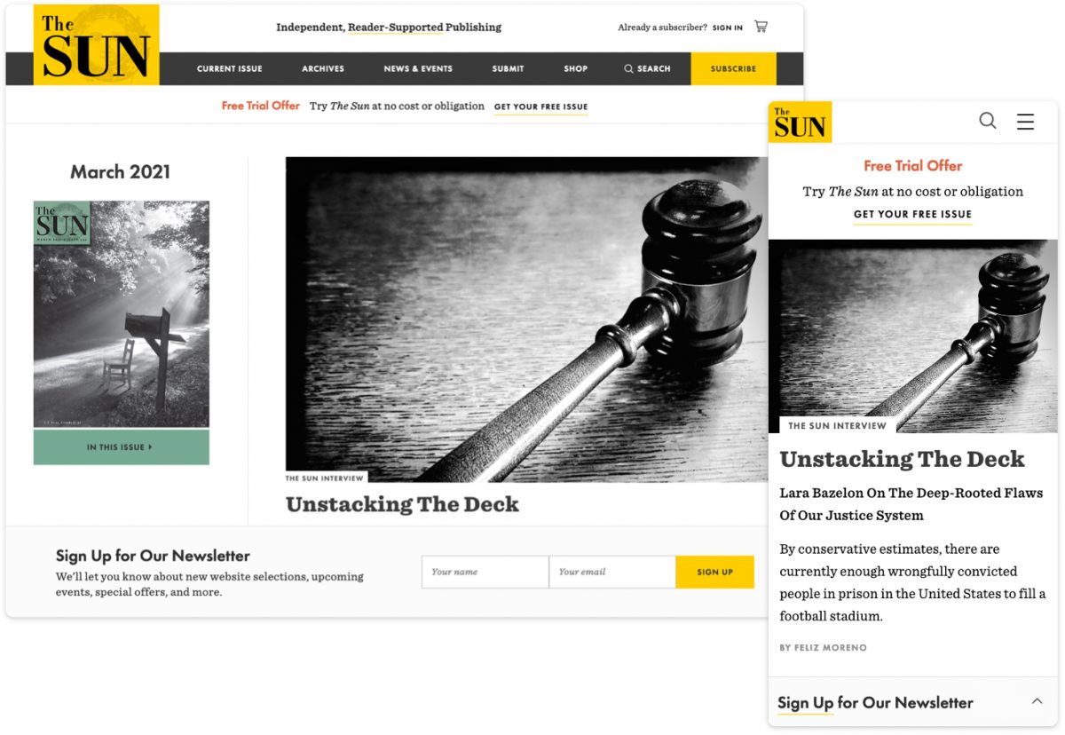
The Sun Magazine
To promote their newsletter, The Sun website features a sticky bar at the bottom of the screen to avoid interrupting the reading experience. The call-to-action comprises 2 states — a collapsed state which takes up minimal space, and an expanded state which reveals the sign-up form. On mobile, the collapsed state is preferred as this stays out of the way of the content. The larger screen size on desktop allows us to present the form upfront without overwhelming the page’s contents.
Similarly, mobile navigation is designed for that purpose — straightforward and always available, allowing the user to easily find what they’re looking for. The desktop navigation makes way for a megamenu experience — a type of expandable menu that lets you design an array of layouts to create an eye-catching table of contents.
3. Mobile Navigation
Responsive menus are navigation menus that are altered on different devices. It can change in multiple ways such as appearing in a different location, having different styling or different content. The user experience is very different on mobile, for example, the buttons are larger since they are tapped on instead of clicked on with a cursor.
The hamburger menu is a staple of mobile navigation. It’s the icon made up of three horizontal lines that you find at the top of mobile sites. It kind of looks like a hamburger — hence the name — and reflects the nature of the mobile menu, stacked to adapt to its smaller vertical screen. It’s a great way to get the navigation out of the way when it’s not needed and have it readily available when it is.
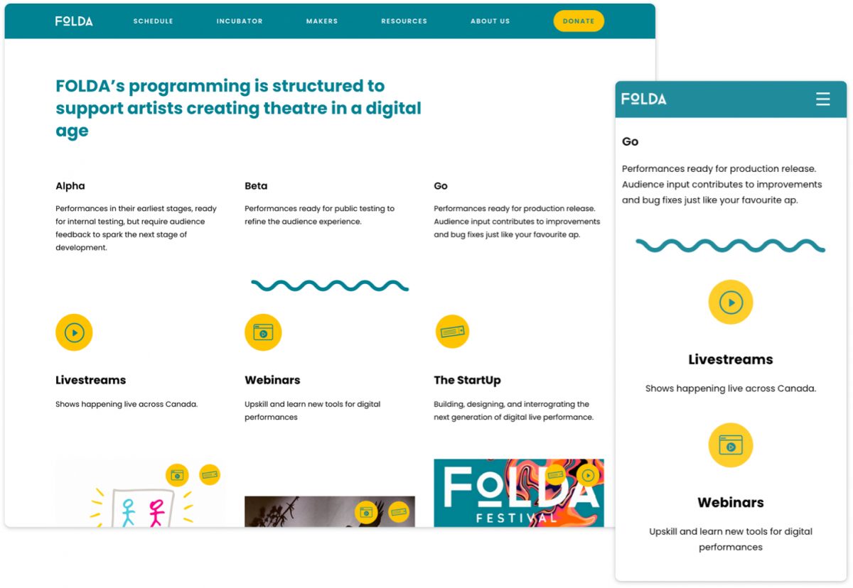
FOLDA
Another example of mobile navigation is a fixed header also called sticky navigation, which is featured on The FOLDA website. When screen real estate is really at a premium, headers can be designed to move off-screen when a user is scrolling down and actively engaging with the content, and then slide back into view when they scroll back up. Having the menu always accessible makes the user feel in control and leads to fewer page exits. Even though scrolling back up only takes a few seconds, not having the menu readily available can be a barrier for your users.
4. Fluid Grids
Fluid grids are another key element of responsive design. They allow your content to resize, stack, and flow to accommodate a wide array of screen sizes. Again, the content-first approach is essential to understanding how your content should be structured and prioritized at all sizes.
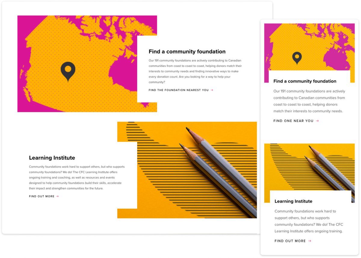
The Community Foundations of Canada
For the CFC website, we capitalized on-screen space to enhance the desktop experience with a dynamic, alternating layout and beautifully balanced use of whitespace. As the screen size begins to shrink, so do the columns. On mobile devices, the content gets stacked but maintains its order of priority. The dynamic white blocks are maintained to create a consistent look and feel across all devices.
5. Flexible Visuals
With flexible visuals, your images resize automatically to fit the screen. Flexible visuals allow designers to control how an image is displayed on horizontal desktop screens versus vertical mobile screens. And since images get scaled down on smaller screens, they can be optimized to load faster and still look sharp.
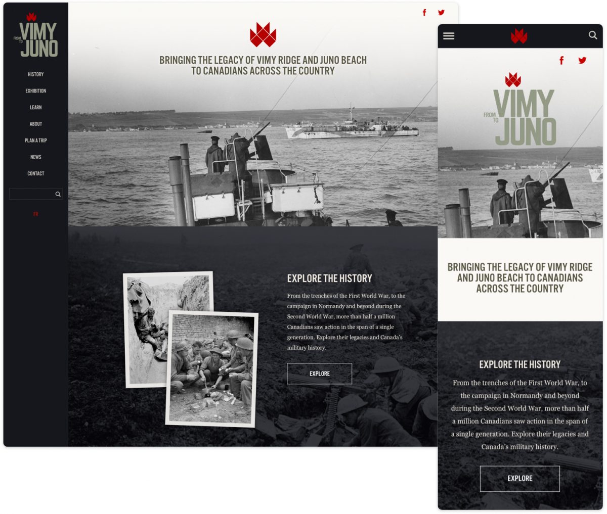
From Vimy to Juno
From Vimy to Juno is a great example of flexible visuals. Whether you’re on mobile or desktop, the images will resize to fit the device being used. Flexible visuals are now common practice for developers, but when talking about responsive design, it’s a necessary point to mention.
