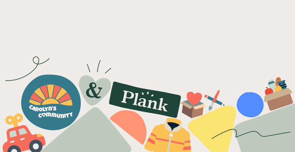
Plank Gives Back x Carolyn’s Community
Author
Stephanie Beasse
Date
November 15, 2023
For the past year, we have been working closely with Carolyn at Carolyn’s Community for our latest Plank Gives Back initiative to help her develop her brand identity and create a WordPress website.
For those who don’t know, Plank Gives Back is our pro bono initiative for non-profits and social organizations that need help improving their digital presence. We provide our expertise once a year to improve one organization’s online presence. This can include a digital marketing strategy, website design refresh, content strategy, or hosting migration.
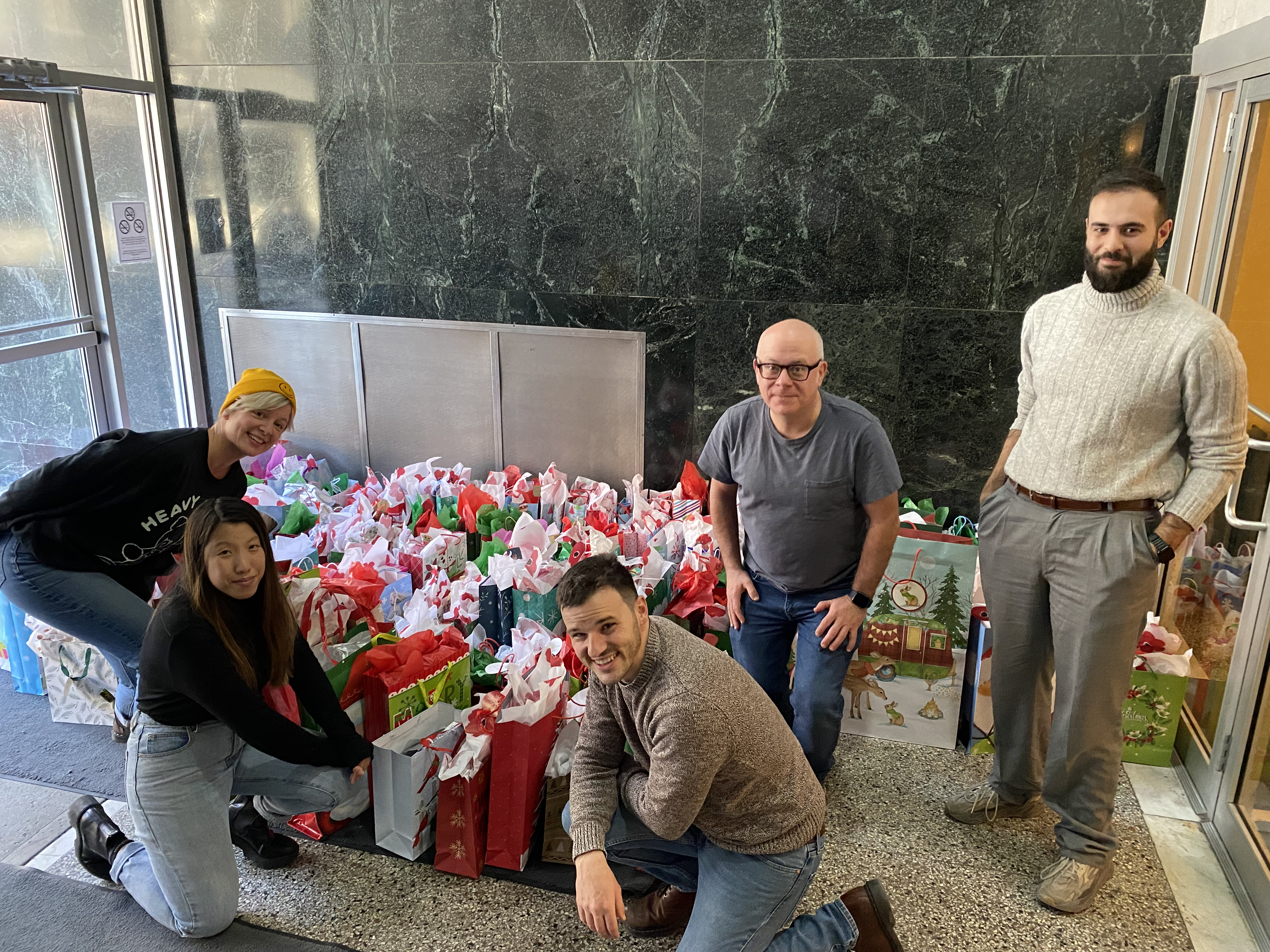
Although we have been working closely with Carolyn on her website, we have participated in her yearly Toy Drive for kids and young adults in shelters for the past three years. Our team has collectively taken on the collection of gifts, led by our Senior Business Strategist, Paisley Nyberg. We have seen the powerful impact Carolyn’s Community has had in Montreal and we were determined to bring her work to a bigger audience.
Since October 2022, we have worked with Carolyn on:
- Brainstorming with our Plank Hack Days
- Developing Carolyn’s Community brand identity
- Defining brand messaging and web page content outlines
- Designing and developing a website
The result is a beautifully designed 5-page website and a brand identity that can be used to further promote Carolyn’s Community to a digital audience.
Kicking Off With Plank Hack Days
We started this project off much like we do our larger-scale projects: by meeting with stakeholders to define the goals and the scope of a project with what we call Plank Hack Days.
Plank Hack Days are an opportunity to kick off a project with hyperproductive sessions that get everyone’s creative juices flowing. Each Hack Day has a set of activities that are chosen based on the project and the team. The goal is to make important decisions that can help push the project forward or to uncover any potential roadblocks.
For Carolyn’s Community, we held three activities to kickstart her brand identity and start brainstorming what her website would look like.
- Goal Setting – a 30-minute exercise used to clearly define goals in the short-term and long-term, and organize them in order of importance. This allowed us to uncover the needs for this project and map out its requirements.
- Rapid Prototyping – A 60-minute activity to create a rough prototype of the home page elements. It is an incredibly effective way to make ideas tangible and to learn through making. Because prototypes are meant only to convey an idea — not to be perfect — we quickly moved through a variety of iterations, building on what we learned.
- Defining Design Style – A preliminary conversation about how Carolyn’s Community would be presented. This includes looking at inspiration boards and pointing out the fonts, colours, and logos that stand out. The results of this exercise assisted us in defining the organization’s design style.
Creating a Colourful and Playful Brand
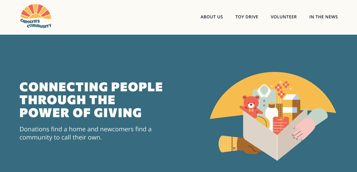
Once we completed our Hack Days sessions Maëlle, the lead designer on this project, set out to design a welcoming and warm logo, colour palette, and design assets.
The Logo
A logo is arguably the most important design element of any brand identity as it is the most recognized and used throughout all aspects of your business. We wanted to make sure that the essence of Carolyn’s Community was well captured and defined through her logo. The result is a warm yet playful logo that evokes kindness, vibrance, and most importantly community.
The sun represents warmth, kindness, and clarity. The sunrise, in particular, portrays the start of something new, evoking feelings of hope, light, brightness, and positivity. The different rays represent the pillars and inclusivity of Carolyn’s Community — the network of individuals, organizations, and communities that Carolyn has built to support one another.
The wave under the sun brings depth and individuality to the logo to represent the unique and personalized aspects of Carolyn’s Community. Rather than a straight line, the wave brings a human element to the sun’s core, portraying the fun and playful personality of Carolyn, her community, and all of her initiatives. Bringing an added retro element to the logo, the heart adds focus to the importance of community — symbolizing that community is at the heart of it all.
The Colour Palette
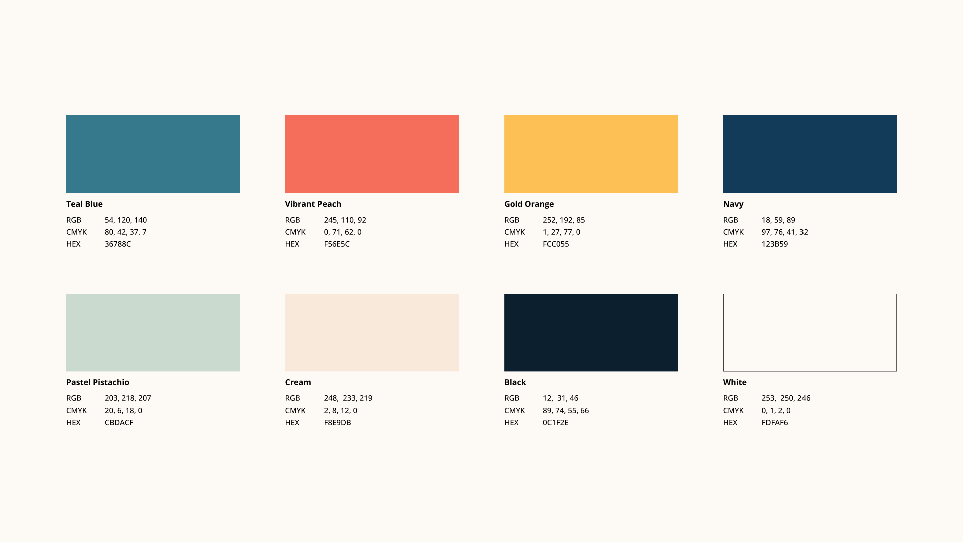
The colours are warm, vibrant, and fun. The blue tones represent trust, calm, and friendliness while the warmer tones bring energy, warmth, and passion.
The Typography
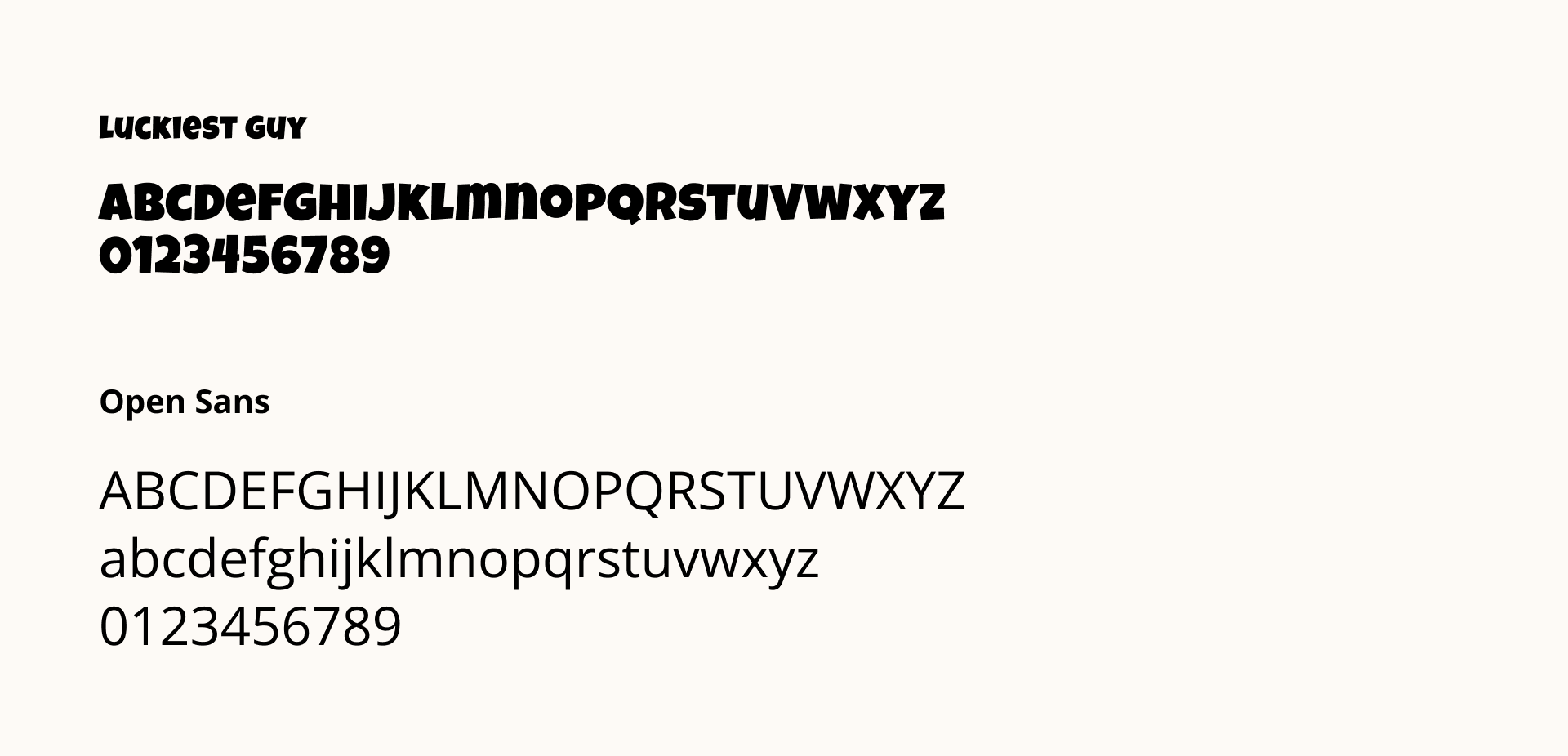
Luckiest Guy is a fun, playful, and friendly font and brings a lot of character and personality to the brand. In terms of body text, Open Sans compliments Luckiest Guy by being simpler and more neutral.
The Brand Elements

A series of illustrations are used throughout the site to highlight all of Carolyn’s Community’s initiatives. These illustrations bring another layer of playfulness to the brand identity and also give visual descriptions of each initiative.
Organizing and Developing Content
We had several in-person and virtual meetings to carefully develop the web pages, their content, and their overall structure. The website features 5 pages: home page, about us, toy drive page, volunteer, and in the news.
Two sections that needed help structurally were the Toy Drive page and the Volunteer page. Both of these pages required simplifying the user journey and condensing pages of information into clear calls to action. Previously, all inquiries for donations, gift purchases, drivers, item drop-offs, etc. were all communicated via email. This required a lot of additional time and effort for Carolyn to explain all the requirements to each individual and made it difficult to keep track of each request.
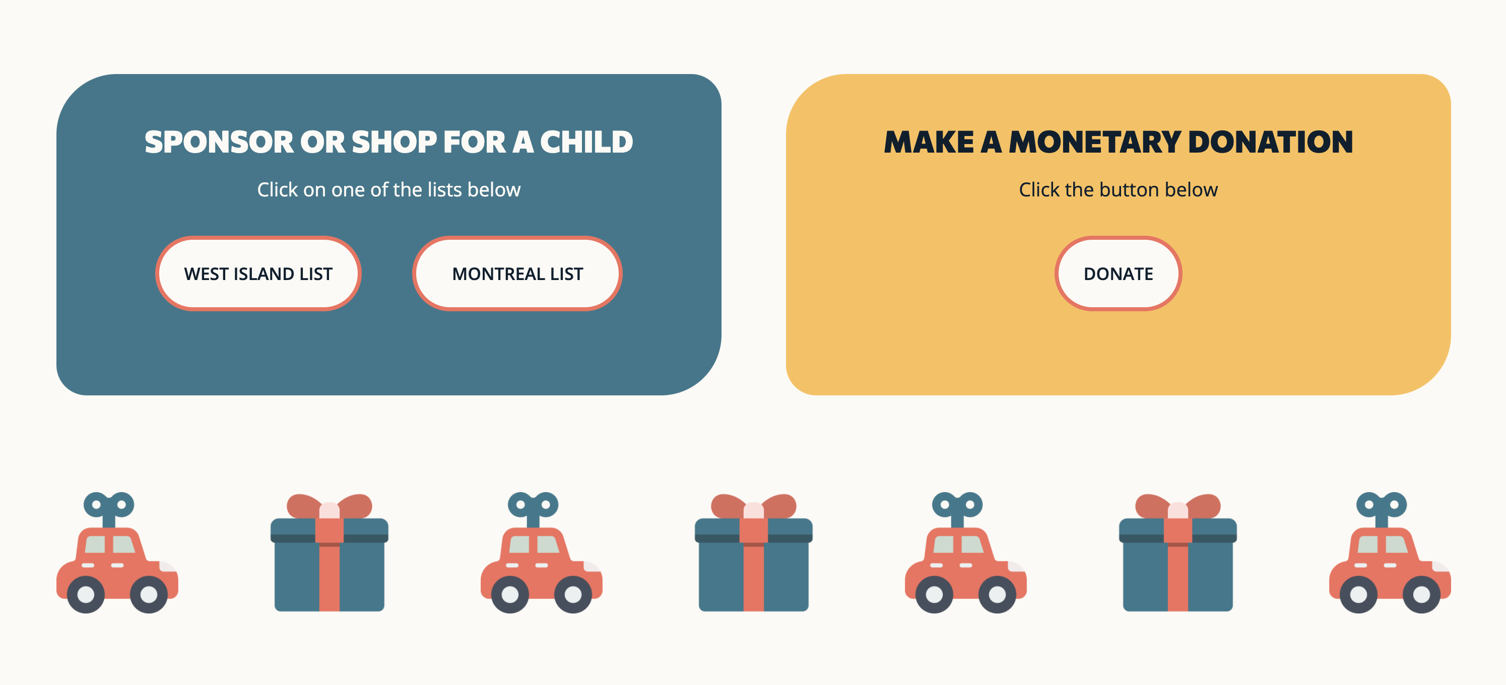
Now these pages contain clear steps on how her community can participate in each initiative as well as an FAQ section to answer any additional questions users may have.
In addition to structuring these pages, we also helped Carolyn edit and write content that would speak directly to her target audience.
Customizing a WordPress Website
For the first time, Plank used the full site editor to build a site. We didn’t rely on a pre-designed template, with full site editing, we were able to customize the site from top to bottom without any code. We created a custom navigation menu, footer, and pages to illustrate and embrace Carolyn’s Community’s warm and vibrant branding.
Throughout the site, we used Carolyn’s Community colourful palette as a solid background. The benefit of using the full site editor is that every block is customizable. It was easy to add rounded corners and bold outlines to blocks and sections. By putting blocks into groups, the layout came together without much difficulty. We wanted a site that was fun, playful, and warm while also tending to Carolyn’s Community needs and brand. The full site editor in WordPress made the entire process seamless.
Plank Loves Carolyn’s Community
We are incredibly proud of the work we’ve completed alongside Carolyn’s Community. Given our close relationship with Carolyn, this year’s PGB was especially personal. We love being able to contribute to the Montreal community and help transform the lives of those in need.
Carolyn has started recruiting gift-givers for this year’s holiday season. We will be providing our office space in Montreal for the third year in a row to pack and store gifts for over 50 children. Visit Carolyn’s website for more information on how you can participate in the 2023 Toy Drive.