
The Canadian Encyclopedia
A Comprehensive Collection of Canadian Stories, People and Culture
Client
The Canadian Encyclopedia
Year
2017 - Present
Expertise
- Content Strategy
- Information Architecture
- Laravel
- UI Design
- UX Design
First published in book form in 1985, The Canadian Encyclopedia has been offered as a free bilingual resource online since 1999 and currently hosts over 20,000 articles. An important resource for educators and students across the country, the new site is fully mobile responsive, friendly to users of all ages, and follows established standards of accessibility.
Why this project was a success
-
1
Created a meaningful user experience through enhanced searching & browsing.
-
2
Improved discoverability, page ranking and site traffic with the restructured database.
-
3
Formed a collaborative partnership based on trust, transparency & effective problem solving.
Project goals
The Canadian Encyclopedia came to us with the ultimate goal of helping users engage with their content in a meaningful way through more effective searching and browsing, and better displaying the diversity of content housed on the site.
They had some major technical challenges as well. The site was suffering from frequent and ongoing downtime, hosting costs were high and growing, and the editorial workflow was not being efficiently handled by their Content Management System. Staff were devoting their energy to dealing with technical problems, distracting them from the real work of developing excellent content. The team at TCE needed a partner who could tackle big design and technical challenges while maintaining an open and transparent working relationship.
Planning and communication
Careful planning and open communication were key to the success of this project. To deal with the workload, we broke it into alpha and beta phases with distinct goals for each deadline. We worked closely with the TCE team to dig in and restructure the content of the site and determine the changes necessary to improve the user experience. Weekly production meetings with core team members kept us on track and clear communication with the client assured everyone was on the same page.
Design for engagement
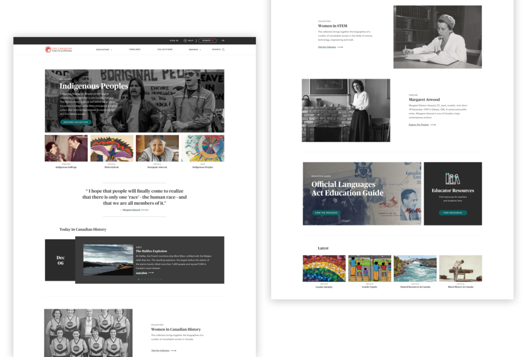
Creating a more engaging user experience required significant structural and visual changes. We began by taking a thorough inventory of the site and analyzing what worked and what didn’t. Simplification was the name of the game. Pages were crowded with content, and useful tools and functions were difficult to find. We moved away from dark backgrounds to white, giving the site more breathing room and making content easier to read.
Mobile priorities
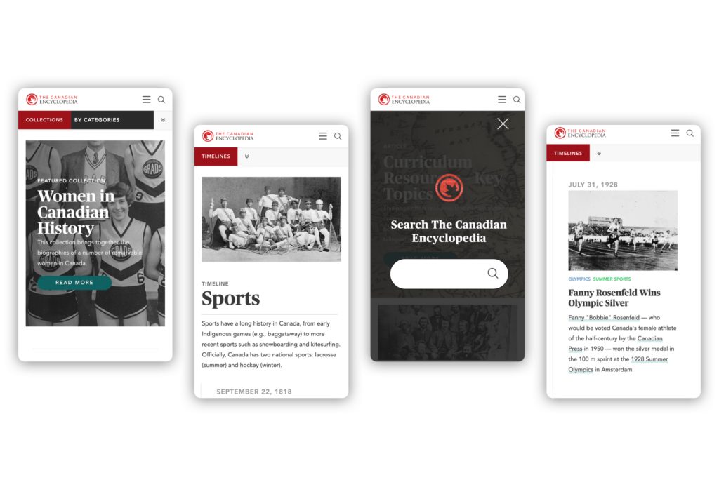
The site is fully mobile-responsive, using one code base to adapt to any screen size. When designing for tablet and mobile, we prioritised the reading experience, minimising callouts and navigation. When visiting a collection on mobile or tablet, articles are prioritised in the navigation, with other content types available for browsing further down the page. The result is a 20% increase in mobile users over the first month of the new site going live.
Data deep-dive
Our backend team rolled up their sleeves and dug into a deep database—that you would expect behind an encyclopedia—to clean house and restructure tables, tags, and commands. Before porting content to a fresh new database, we combed through legacy data, discarding what was unused and speeding up searching and indexing site-wide. We implemented cascading commands to ensure that future data deletion would automatically include attached data and avoid “orphaned” data remaining in the database and causing page crashes.
Search and you will find
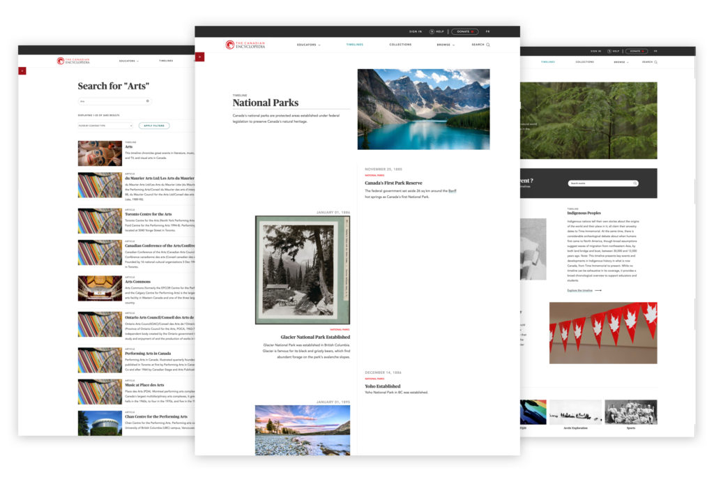
We made search results more relevant and added filters to refine by topic and content type. Using Elasticsearch, we tweaked and customised the configurations to handle a mix of filters alongside a search term. Materials can now be sorted by date range within timelines, and search for topics within content types.
Architecture for better browsing
To simplify navigation and create a more useful browsing experience, we worked with the team at TCE to re-work the hierarchy of topics, reducing the number of top-level categories, and adding a mid-level to guide the user towards areas of interest, without overwhelming them with choices. Only the most relevant menu items are displayed in the top navigation, with several secondary items moved to a sidebar on the second screen of the browsing process.
Our developers worked closely with our designers and TCE editors to streamline the categorization system and redistribute content accordingly. The article tag system was also improved, eliminating duplicates and creating connections between French and English tags, to ensure a consistent list of articles for each tag across languages.
Focused reading
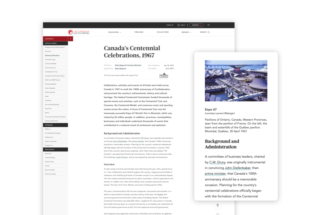
To improve the reading experience for individual articles we pared down the cluttered sidebar, moving the most useful widgets and callouts to the end of an article, and discarding those that weren’t living up to their potential. The left article sidebar now houses an index to allow users to jump to the different sections, while utility action items are open by default on the right allowing the reader to print, cite, share, or give feedback on the article. Recommended articles, further reading, external links and monetisation widgets follow the article to reduce distraction while reading.
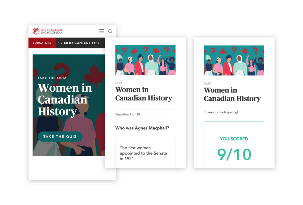
Educational resources
Students and teachers are an important user group for TCE. We re-worked the education section to show content grouped by curriculum topics, rather than by format (quizzes, study guides, timelines, etc). Teachers can still search by content type or browse all materials for a certain topic. We also revamped the “Your Canada” section that allows users to add their own stories of the Canadian experience and can be explored by map location or story theme.
Content management
We gave the editorial team control over featured content and an improved workflow with a custom CMS. Functions that previously required steps to be taken on a number of different pages (like assigning articles to timelines) have been streamlined and simplified. The CMS supports the modularity of the new site, allowing editors to re-order content blocks and refresh featured content whenever they like.
To offer users a greater discoverability of content, we built a selector for the editorial team to choose multiple potential featured articles that will display differently every time the page is loaded.
Managing resources
The vast amount of data on the site, and the multiple relationships between pieces of content gave us some great challenges in managing resources and processing power. To support the display of randomly refreshed content on the homepage, for example, we developed a mechanism for caching and displaying dynamic randomised data without impacting server resources.
Timelines are made up of numerous content pieces grouped by theme and ordered by date. Users can filter by theme and jump to date ranges within that theme. Keeping all of those pieces ordered and available takes a lot of processing power. Optimizing code and trimming the number of queries was a top priority to ensure site stability and performance.
Ongoing support
Our work with The Canadian Encyclopedia is by no means finished. We continue to make incremental and iterative improvements to the site to help users learn more about Canada.
About the client
First published in book form in 1985, The Canadian Encyclopedia has been offered as a free bilingual resource online since 1999 and currently hosts over 20,000 articles. An important resource for educators and students across the country, the new site is fully mobile responsive, friendly to users of all ages, and follows established standards of accessibility.


