3 Ways to Increase Your Non-Profits’ Website Donations
Author
Stephanie Beasse
Date
janvier 18, 2021

I don’t know how long we’ll be talking about the year 2020, but let’s be honest, it really changed the giving space for arts and culture organisations. Whereas nonprofits that focus on hunger and health have seen increases in giving (which is a good thing considering we’re in a pandemic), arts organisations have been left in a tough position.
Ticket sales and in-person fundraising events basically disappeared overnight and that led them to rely solely on online support. Below are 3 changes to your website that will help boost your donations.
1) Catch their eye
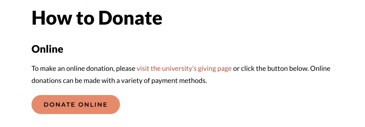
Don’t underestimate your Call-to-actions! Call-to-action (CTA) buttons are one of the bases of your webpage. They lead your visitors to desired actions and improve their user experience. There are a few places you should include your CTA’s in order to increase your non-profit donations.
- In your header – your website header is one of the most viewed parts of your website, and the perfect place to catch the eye of a potential donor. This CTA button should lead them to your donation page (another critical page needed to boost your donations).

- Above the fold – once a visitor is brought to your donation page, there should be a CTA in sight without needing to scroll. A lot of people don’t have the patience to scroll before getting to the good stuff. To convert those individuals, it’s best to include a video and/or image and a paragraph describing the benefits of donating, followed by a simple CTA.

- At the bottom of your page – some of your supporters need more convincing. For those users, you should include a CTA after you’ve gone over all the benefits and successes of donating to your organization.
So you’ve got the placement down, but what about a CTA’s text and format?
- Short & Concise – when you’re writing your CTA buttons, it’s important to use actionable and descriptive language such as “Donate Today” or “Donate Online”. You want to avoid vague language such as “Support Us”, which could be interpreted in different ways. You also want to avoid CTA’s that are longer than 20 characters, short and concise always wins.
- Bold & Animated – if you really want your CTA to catch a visitor’s eye, make it bold and animated. For example, The Canadian Encyclopedia’s CTA is unique and eye-catching with the cute heart that grows when a cursor is hovering.
2) Keep it simple
The tried and true KISS principle (aka Keep It Simple, Stupid), remains relevant for your donation process. The last thing you want is a user abandoning their donation because it’s too complicated. Creating an easy-to-follow process is the best way to make sure more people follow through on their donations.
There are several ways to accomplish this, let’s outline a couple of the best:
- Third-Party Integration – we recommend including a simple donation form directly on your website to avoid sending users to another page. Using a 3rd party integration tool will create trust in the security of your site and provide visitors with a familiar UX. It will also make your supporter’s experience seamless while making it easier for you. Saving you the hassle of managing all your donations on an excel spreadsheet, yuck. Here are some examples:
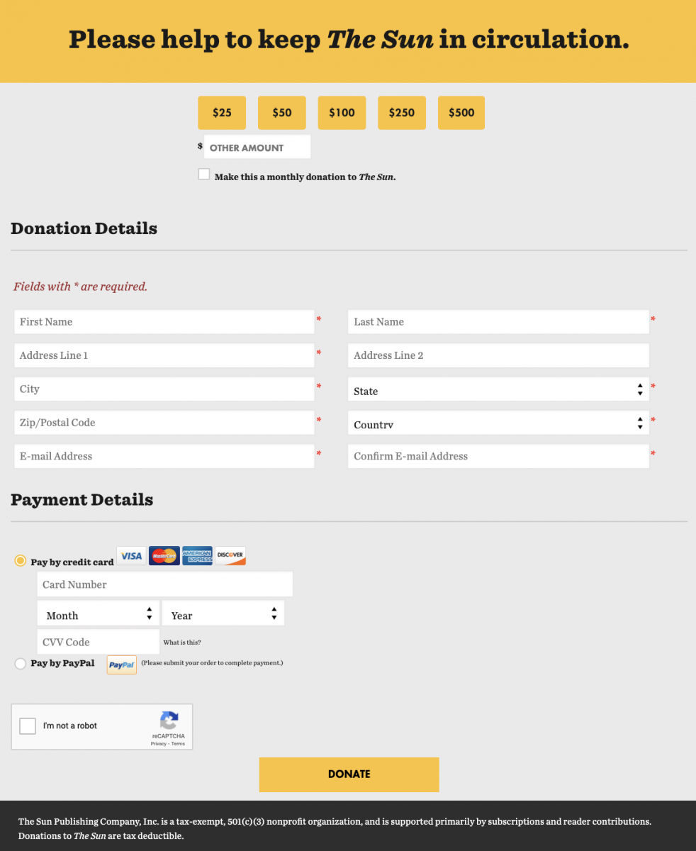
- Keep Mobile Users in Mind – don’t forget about your mobile users. Want to know if your donation process is simple? Test it on mobile. If you feel like you’re reading a never-ending scroll, your donation page is too long. And this isn’t only about length. Mobile-optimised websites automatically fit your donor’s device, making their experience more enjoyable overall. More enjoyable experience = more donations. A good example to follow would be The Sun Magazine. Their donation form performs really well on mobile and isn’t too long.

3) Be transparent
An important factor to consider when asking for donations is transparency. Most people want to know how their donation will be used and how it will benefit your cause.
Below are a few ways you can give donors more information about donations.
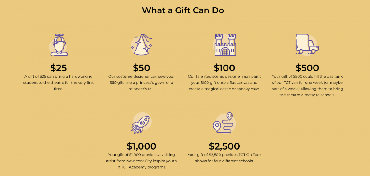
- What a donation can do – try including a content block that states how an individual’s donation will be used. It can help a user decide how much they want to donate and give them an incentive to help your cause. The Children’s Theatre of Cincinnati does this well with their “what a gift can do” section found on their donation page.

- Benefits for sponsors – if your nonprofit provides sponsors with something in return for donating, this information should be provided on the website. Whether it’s free tickets to a show or a plaque at your institution, being honest will garner more trust from your audience. The Children’s Theatre of Cincinnati also does this well with its “Benefits of Donating” section seen below.

- Website Accessibility – this one might not be immediately obvious but accessibility strongly contributes to your transparency. If a supporter can’t properly read your web page they are far less likely to donate, and this extends to past donations too. Transparency should be awarded to all your supporters no matter their disabilities. To test your page, you can use https://web.dev/.
Final Thoughts
There are many ways you can boost your number of donations, but a well built website is your foundation. No matter what your goal is, a website that’s mobile-optimized, accessible, and that provides a great UX/UI will yield better results.
Having a great website is the best way to boost your number of online donations while also contributing to every other aspect of your digital presence.
