Web Accessibility: 12 Tips for Publishing Inclusive Content
Author
Stephanie Beasse
Date
février 10, 2021

You’ve probably heard a lot about web accessibility lately, but why is it important? What accessibility essentially boils down to is: essential for some and useful for all. Web accessibility is about making digital spaces inclusive to everyone who comes across them, no matter their disabilities. When your website is more inclusive you make your content available to more people, improve your overall user experience and even improve your SEO. That means there’s absolutely no reason you shouldn’t make the extra effort to help those who need it.
The first and foremost step to build an accessible product is to build empathy and install an inclusive design mentality.
Avinash Kaur, UI/UX designer featured on UX Collective
First Things First, What is Web Accessibility?
When it comes to the web, accessibility means that anything on the screen, whether it’s websites, tools, or technology, are designed and developed so those with disabilities can use them.
The W3C Web Accessibility Initiative (WAI) is an initiative that brings together industry professionals, disability organizations, governments, and research labs from all over the world. Their goal is to write the Web Content Accessible Guidelines (WCAG). These guidelines help individuals use the web to their full potential. And since technology and online experiences are constantly evolving, these guidelines are also constantly being updated and improved.
These guidelines will be especially helpful if you are a web developer, content creator, and/or an evaluation tool developer.
4 core principles are used to allow individuals to perceive, navigate, understand, and interact with the web to the best of their ability.

4 Core Principles of Accessibility
- Perceivable – This is what individuals can perceive on their screen. The word perceive is important, because not everyone can see their screen or hear their audio. They should, however, be able to perceive the same information. There are tools, like screen readers, that allows people to understand information.
- Operable – This is how individuals navigate through interface components, such as scrollbars, buttons, checkboxes, etc. Some individuals cannot scroll through a website with a mouse and will use a keyboard to navigate instead.
- Understandable – Individuals don’t have the same capacity of understanding, so this principle is probably the most important for content writers. It’s important to write content in a way that everyone can understand. This includes text, images, audio, and videos.
- Robust – This principle takes into consideration the evolution of technology. You want your website to be as compatible as possible with current and future user agents, including assistive technologies.
Why Accessibility is Crucial
15-20% of the population has a disability
Shadi Abou-Zahra, technology specialist at W3C
There is a huge misconception that only a small percentage of the population deals with these challenges. That is not the case at all. The reality is that 15 to 20 percent of the population has a disability. And a lot of people have challenges when they use technology. If you don’t make your webpage more inclusive, you could be alienating 1 in 5 users who are viewing your content. That isn’t beneficial to anyone and shouldn’t be ignored.
Tips for Writing & Publishing Accessible Content
1) Use Contrasting Colours
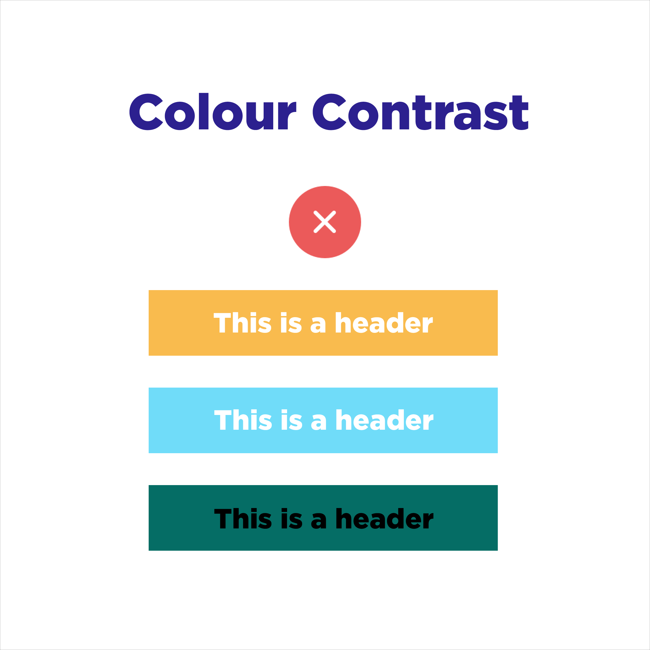
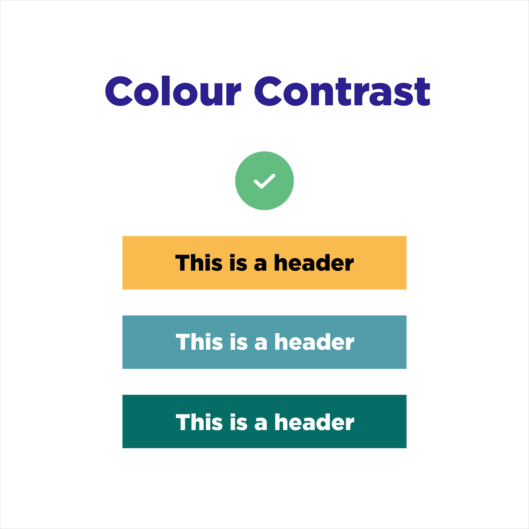
We don’t all perceive colours in the same way, whether it’s because of vision impairment, colour blindness, or even the screen type. It’s important to use colours with enough contrast so the text is visible to your users. As seen in the example below, you shouldn’t use a light background with light text. You also shouldn’t use a dark background with dark text. Instead, opt for opposing colours to catch the user’s eye and that are easily distinguishable.
2) Use Whitespace
White space is critical for a better user experience. Well-spaced out content is also an excellent accessibility practice because it can make your content more understandable. Users will be able to quickly scan your website and find the information they’re looking for. Having no negative space can cause users to be overwhelmed and frustrated due to a cluttered page. For more on whitespace, read our blog post: Embracing Whitespace.
3) Avoid Text on Images
Text on images is a mistake that is seen often. It also doesn’t follow accessibility guidelines. It can be done properly if you use contrasting colours. If you have a dark image, opt for white text. If you have a light image, opt for black text. If you’re struggling to find the right text colour, add a gradient on top instead. This way the text will stand out and remain legible.

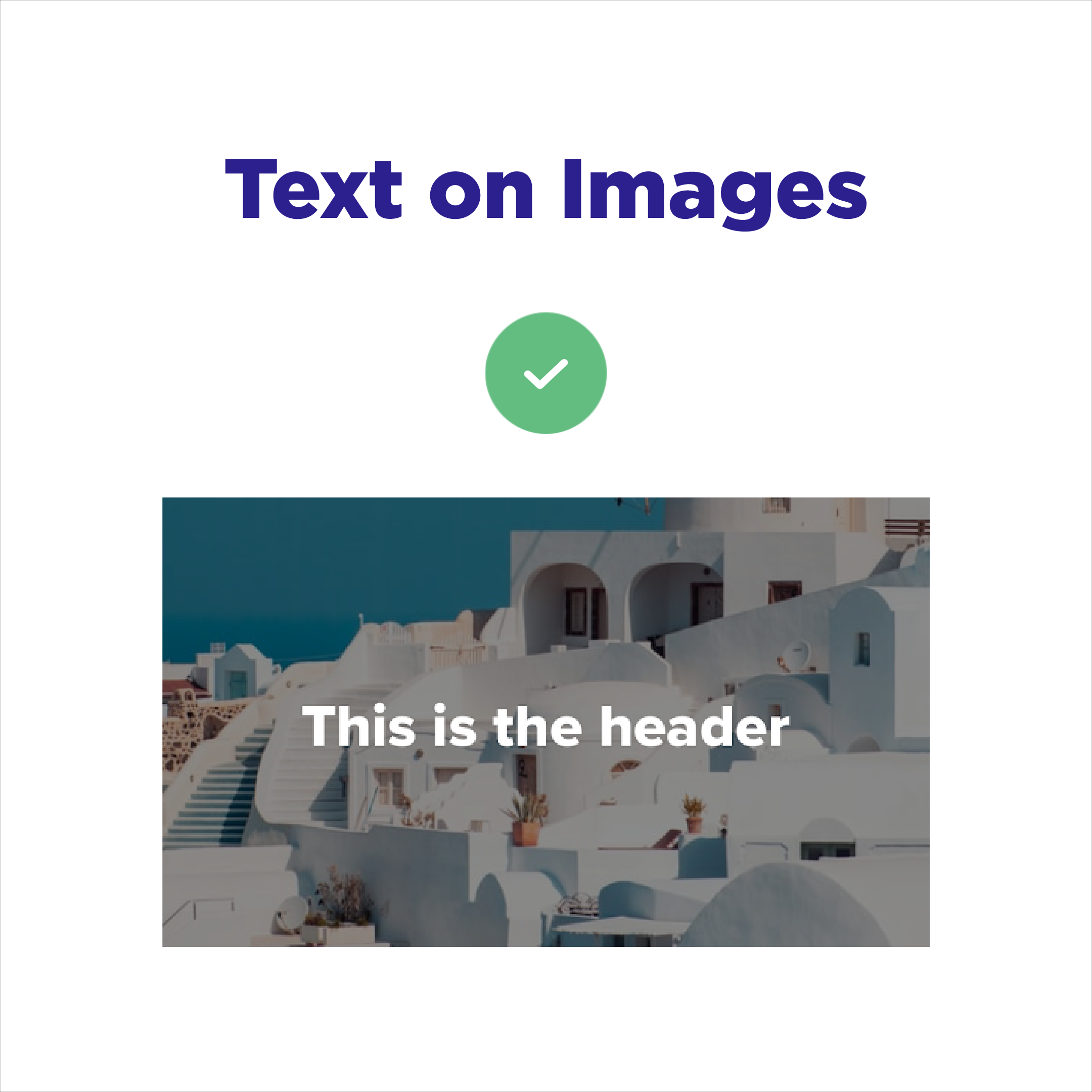
4) Use Properly Formatted Text on Images
If you’re convinced that your featured blog images need text, you should consider how it’s read with a screen reader. Make sure that you don’t upload an image with flattened text, as the text won’t be picked up by screen readers. It also has the potential of getting cut off and being illegible when the image is resized. Make sure you write your text directly on the image using your Content Management System so you can select it with your mouse.
5) Use Proper Text Hierarchy
There are usually six types of headings available, ranging from H1 to H6. H1 is the most important heading and H6 the least. You should be using them in the proper order. For example, in this blog post, we use H3 headings to identify each section. H4 headings are used as titles for each subpoint. These different font weights are used to differentiate between titles and subtitles throughout the post.
6) Use Alternative Text
Alternative text (also known as alt-text) is the description of images that are read by screen readers. This shouldn’t be confused with an image caption, which is shown directly underneath the image. The description needs to be precise and concise, as it usually has a maximum of 125 characters. The ultimate goal is to describe the image to those who use screen readers.
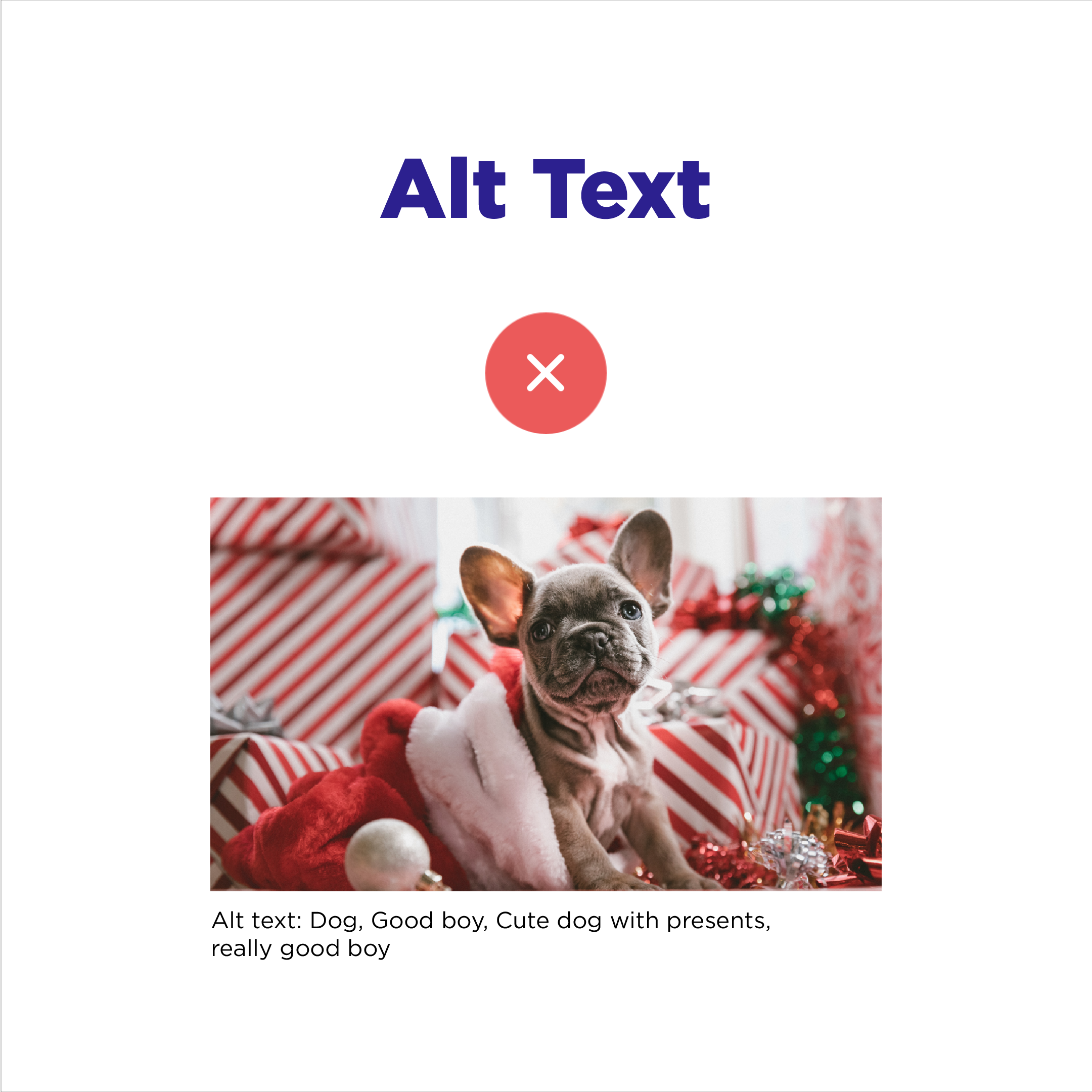

7) Use Image Captions
You should describe your images concisely and precisely to help users understand what is being depicted. Captions are useful when someone’s internet isn’t loading images. Make sure your point gets across even if they can’t see the image. A caption is also a great place to cite your sources.
8) Avoid Wordy Call-To-Actions
When you’re writing your button copy, you want it to be descriptive and short. The user should know what the Call-to-Action (CTA) button will do without reading the body text. They should know where they are going and what action will follow. This creates a better user experience and avoids confusion.


9) Avoid Guilt Inducing CTA Buttons
You also don’t want to make the user feel guilty for choosing one option over another. This practice is extremely misleading, confusing and unempathetic, which are all bad practices in your efforts to be accessible.
10) Avoid Pop-Ups
Pop-ups are another example of inaccessible and potentially unethical practices. It appears unprofessional when you trick your users into clicking a CTA. It should be easy to find and exit your pop-up. If you want to use pop-ups make sure the exit button is clearly visible and easy to use.
11) Use Mindful Copywriting
Remember, you must write in a way that most people can understand. You cannot assume that everyone understands expressions, industry language, or what an acronym stands for. When writing an acronym, make sure to explain what it stands for beforehand. This also applies to expressions. If you do use one, make sure to explain the definition before.
12) Use a Balance of Content & Images
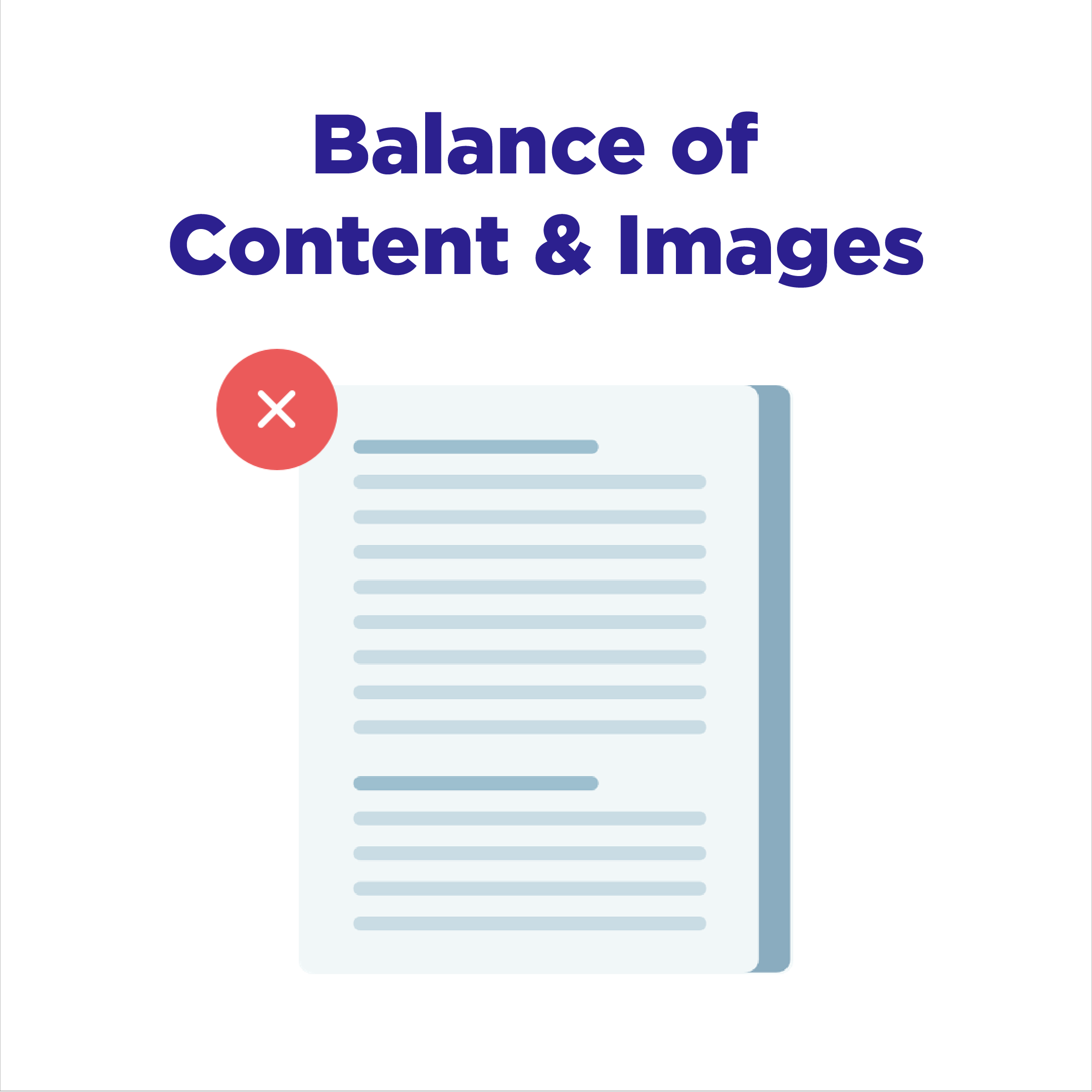
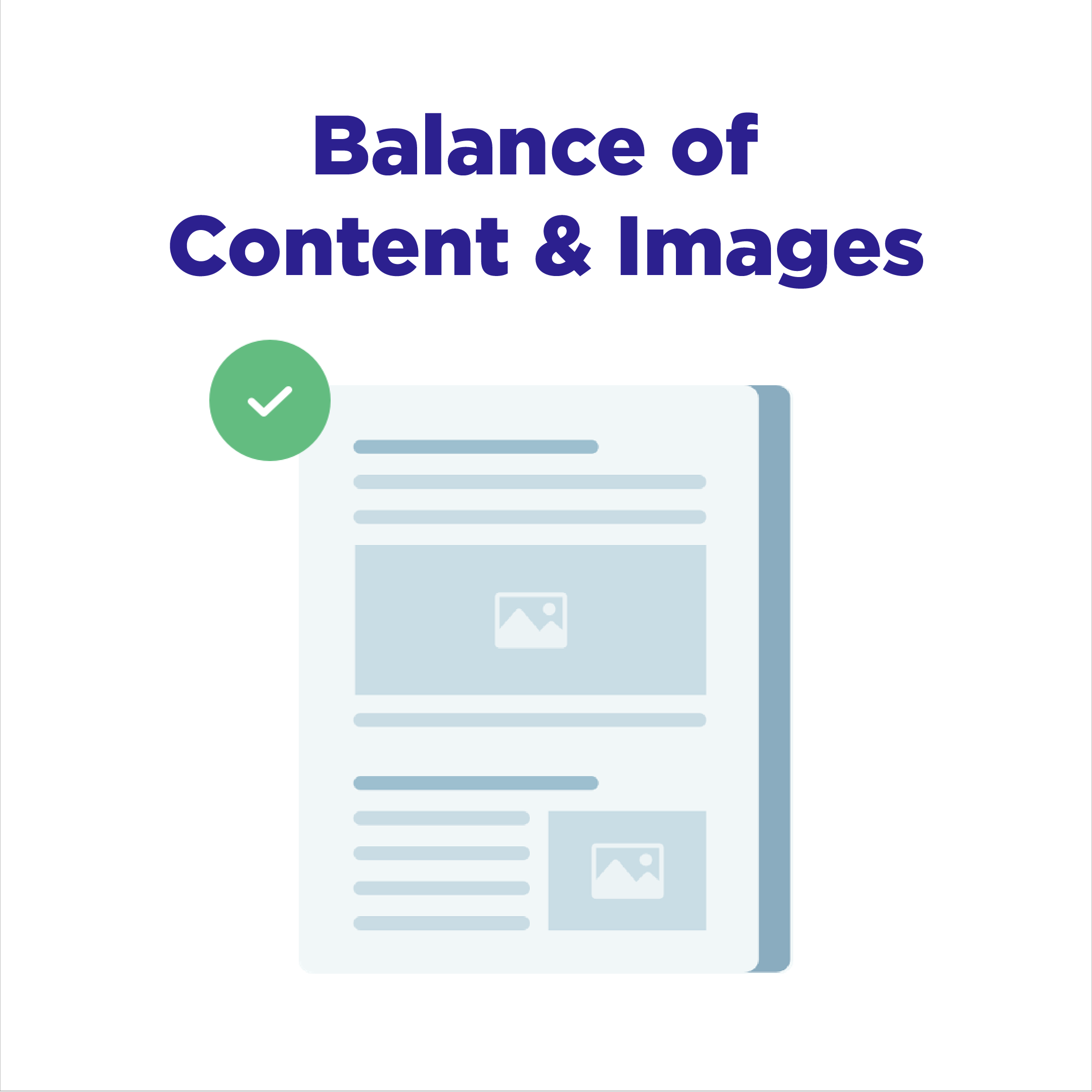
A good habit to get into is using images, videos, quotes, or audio files to break up your text. No one wants to read a wall of text. Not only is it boring, but it’s also extremely hard to read. Having something like a graphic or stat to break up your text can help users digest what they’ve read and help them understand it.
