The 5 Core Elements of Responsive Web Design (2025)
Author
Stephanie Beasse
Date
November 21, 2025

In 2025, users expect websites to be fast, adaptable, and accessible no matter the device or screen size they’re using. Whether they are purchasing tickets on their mobile devices or making a donation on their desktop, your design must adapt to their needs seamlessly.
Responsive design started making waves around 2010 when Ethan Marcotte published his first blog post on the topic called Responsive Web Design. Since then, it has become a foundational practice for web designers. Although a standard practice that’s over a decade old, responsive design continues to evolve.
This is our way forward. Rather than tailoring disconnected designs to each of an ever-increasing number of web devices, we can treat them as facets of the same experience.
Ethan Marcotte, via A List Apart
Now, modern responsive design is about building flexible systems that provide a consistent and inclusive experience for every user.
What is Responsive Design?

Simply put, responsive design is a flexible way for a design layout to adapt to different device sizes and types. Not only are screen sizes different, but so is the overall experience. On a desktop, you could be using a mouse, with a laptop, a trackpad, and on mobile, your touchscreen. A web designer’s goal is to ensure a comparable experience across all devices.
What does that look like? Well, there are a ton of different elements that go into responsive design. It’s a header navigation turning into an expandable menu. It looks like four columns resizing into one. It could also be images adapting to smaller screens. All of these lead to an equally suitable experience across mobile and desktop.
Mobile-first Design vs Responsive Design
Organizations looking to redesign their website will most often ask for a mobile-first site, as a majority of their users are on mobile. Mobile-first design and responsive design work together, but they solve different problems.
- Mobile-first design is an approach to planning, structuring, and designing a website starting from the smallest screen size. It ensures that core content, navigation, and actions work perfectly on mobile before scaling up to larger devices. It’s about prioritization: deciding what’s essential, what comes first, and how to create a streamlined user journey when space is limited.
- Responsive design, on the other hand, makes the layout, images, typography, and components adapt fluidly to different screen sizes and environments. It uses CSS techniques like fluid grids, media queries, and container queries to make the same content work across all devices.
Mobile-first is a design and content strategy, while responsive design is the system that makes the interface adapt everywhere. Together, they ensure that the experience is thoughtful, accessible, and usable on any device.
Responsive Design and Accessibility
Responsive design plays a critical role in web accessibility. Beyond readable and navigable content across devices, it also takes users with different abilities and contexts into account. A responsive interface adapts not just to screen size, but also to different input methods (touch, keyboard, assistive tech), and user preferences such as reduced motion or dark mode.
RELATED: Web Accessibility: 12 Tips for Publishing Inclusive Content
Responsive design helps users with low vision, mobility impairments, and cognitive challenges access information without barriers. It is a foundational part of creating an inclusive, equitable web experience for all users.
Below are the five core elements of responsive web design in 2025:
1. Flexible Layouts with Modern CSS
The foundation of responsive design has shifted significantly over the past few years. Instead of relying solely on rigid breakpoints tied to specific device widths, today’s best practices incorporate content-driven layouts powered by CSS Grids and container queries. These tools allow components to respond to the space they have available, not the overall size of the screen. This means a card, a form, or a navigation element can automatically adjust its structure based on where it lives within the layout.
Modern responsive layouts also use fluid spacing, adaptable components, and functions to create predictable scaling without jumping abruptly between layouts.
This approach results in designs that feel natural at every size and reduces layout shifts. This maintains consistency across site structures without relying on one-off breakpoints.
2. Fluid Typography
Typography is one of the most important elements of any digital experience, and in 2025, it must adapt as gracefully as the layout around it. Fluid typography uses clamp functions to automatically scale text between a minimum and maximum size, creating comfortable reading experiences on both small and large screens. This eliminates the classic issues of oversized headings on mobile or tiny body text on desktop.
Appropriate line lengths, spacing adjustments, and respect for user settings, such as increased text size or reduced motion, fluid typography ensures that content remains readable for all users.
3. Flexible Images and Assets
Images and media are often the largest assets on a webpage, which makes their responsiveness critical to performance. Modern responsive design ensures images are delivered at the most appropriate resolution for each device. This prevents mobile users from downloading unnecessarily large files and helps high-density screens display crisp imagery.
Responsive design also incorporates techniques like lazy-loading and explicit width and height attributes to avoid cumulative layout shifts (CLS). SVG graphics are used wherever possible for icons and illustrations, as they scale infinitely and stay sharp on any display.
Together, these practices ensure that images load quickly, remain visually clear, and contribute positively to the overall user experience.
4. Mobile Navigation
A strong mobile experience requires mobile navigation to be simple, intuitive, and adapted to touch interactions. This goes far beyond the traditional hamburger menu. Today’s responsive navigation patterns rely on clear hierarchy, generous touch targets, and layouts that reduce friction for users navigating with one hand.
Mobile navigation is supported by patterns like accordion menus for deeper structures, bottom navigation bars for high-priority actions, and sticky navigation that stays accessible as users scroll. Search-first navigation has also become a powerful tool for large or complex websites, helping users jump directly to the content they need.
A strong responsive navigation strategy ensures that visitors can move through the site confidently, whether they’re booking tickets, reading articles, making a donation, or browsing on the go.
5. Optimized Performance
Performance is an important element of responsive design. A truly responsive site doesn’t just rearrange content; it smartly adjusts what is loaded, how it’s delivered, and when it becomes available.
Techniques such as lazy-loading below-the-fold content, deferring non-essential scripts, minimizing render-blocking resources, and using responsive components that adapt without layout thrashing all help pages feel faster and more stable. For users on mobile networks, low-bandwidth environments, or older devices, these optimizations ensure the site remains accessible and reliable.
Responsive Website Examples
Here are examples of organizations that implement responsive design for a consistent user experience across devices.
1. Futurpreneur

Futurpreneur is a great example of responsive web design is a site that carries its playful desktop animations seamlessly into the mobile experience without overwhelming the smaller screen. Animations scale fluidly, load efficiently, and remain fully accessible, giving users the same sense of delight on their phone as they would on a large display. This shows that mobile design doesn’t have to be a simplified or watered-down version of desktop. When done well, responsive design preserves the fun, storytelling, and brand expression that users love, while still feeling intuitive and effortless to use on smaller devices.
2. Claremont Graduate University

Many storytelling sites are designed with desktop in mind, where full-width visuals, layered animations, and long-form narrative sequences can unfold without constraint. But in today’s mobile-first world, it’s just as important to craft these experiences for users on the go.
Claremont Graduate University’s centennial project demonstrates that immersive storytelling doesn’t need to be limited to large screens. When thoughtfully adapted, the same narrative, animations, and emotional impact can translate beautifully to mobile. By rethinking pacing and using touch-friendly patterns like swipeable panels or scroll-triggered transitions, the story becomes accessible anywhere. This ensures that whether a visitor is at their desk or on their phone, they can fully immerse themselves in the organization’s journey.
3. Carolina Performing Arts
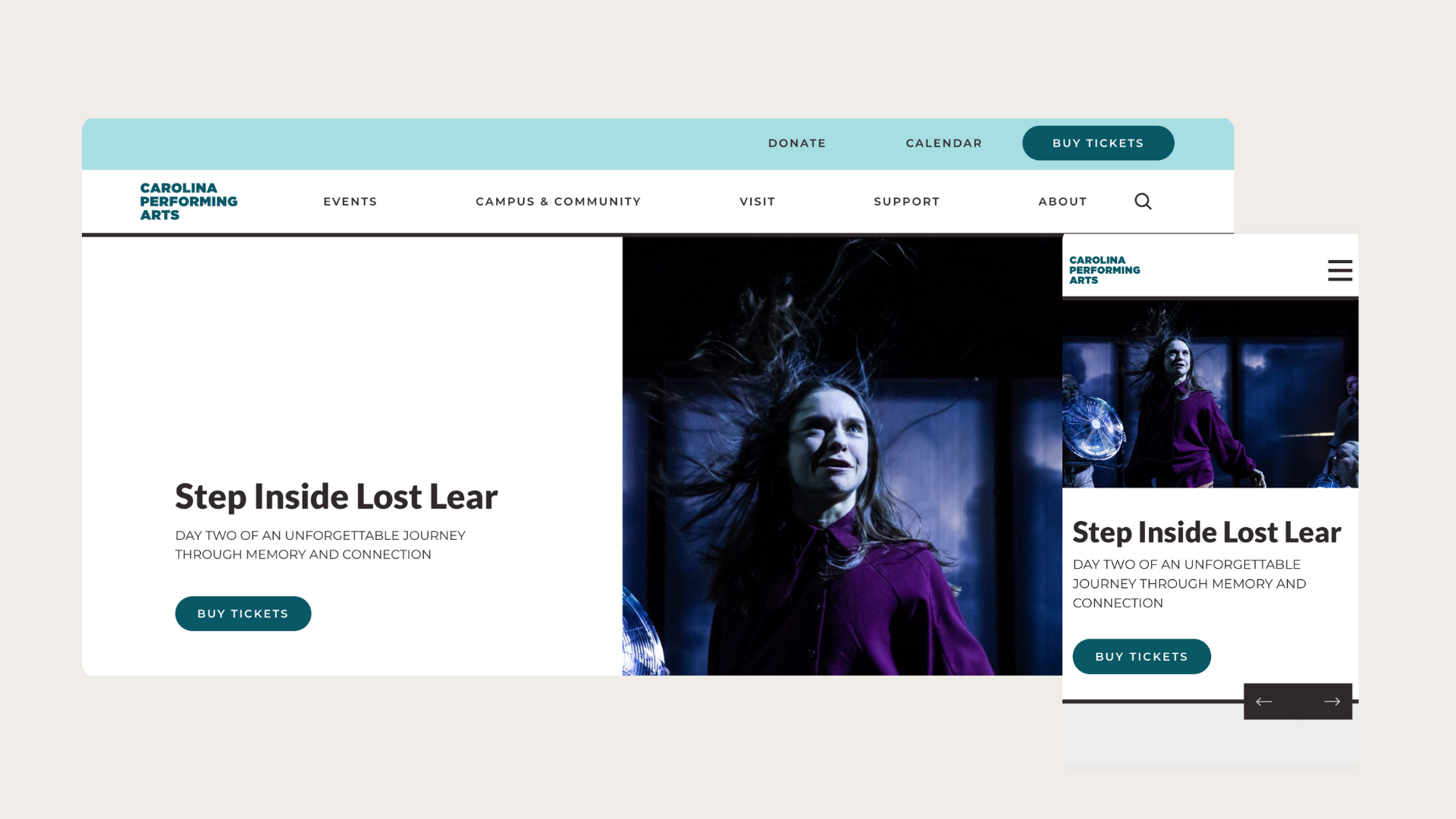
For arts and culture organizations, delivering a seamless ticketing experience on desktop and mobile is no longer optional. With mobile audiences growing, they often discover events on social media, browse showtimes during their commute, or make last-minute decisions from their phones, which means the ticketing flow must be effortless on small screens.
The Caroline Performing Arts has a mobile ticketing journey that has clear performance dates, prominent “Buy Tickets” buttons, and a streamlined checkout that minimizes steps. When ticket purchasing feels quick, intuitive, and friction-free, organizations see higher conversions, fewer abandoned carts, and a more satisfied audience ready to return.
4. Canadian National Exhibition
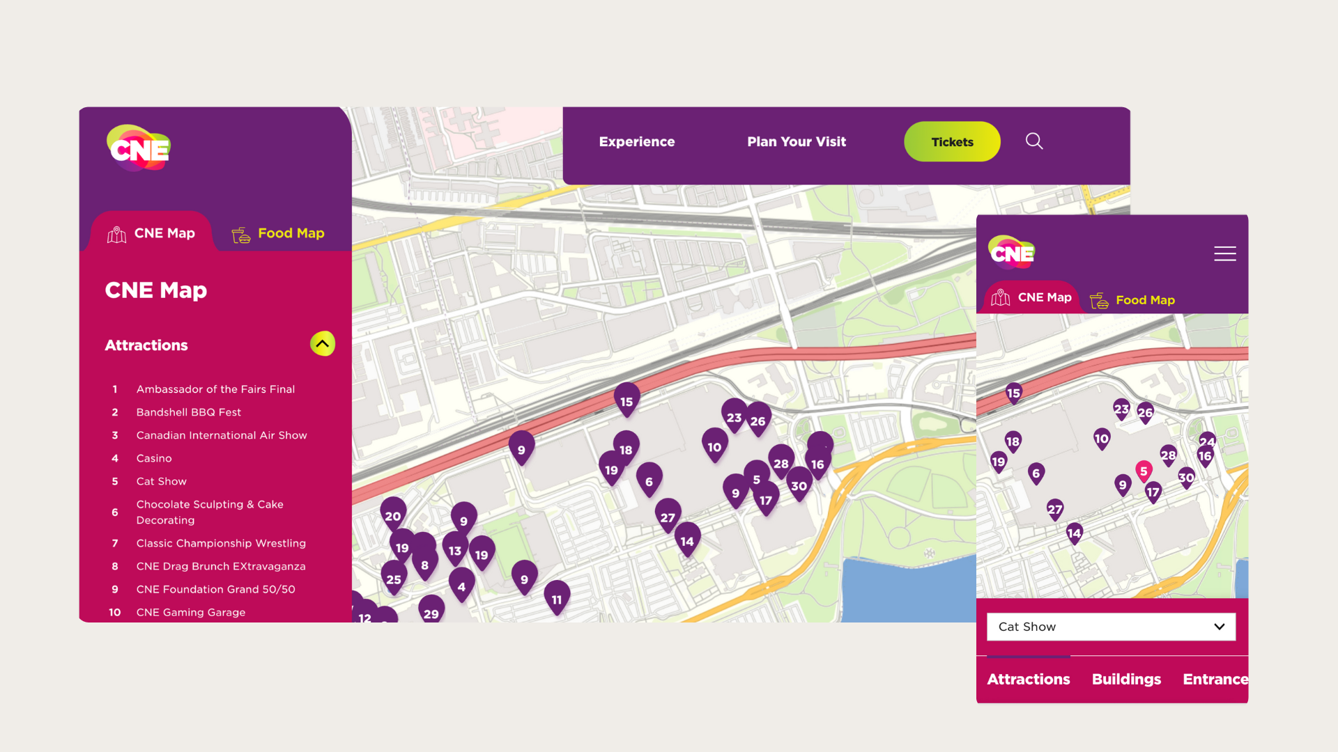
For festival websites, the mobile map experience is one of the most important tools attendees rely on while navigating the event. The Canadian National Exhibition has a map that allows users to quickly locate stages, food vendors, rest areas, and amenities even in crowded, fast-moving environments. Filters help users surface only what they need (like washrooms or exhibits), while expandable panels provide quick access to details without leaving the map. When done well, a responsive festival map transforms the on-site experience, helping attendees feel confident, informed, and free to focus on enjoying the event.
5. The Canadian Encyclopedia
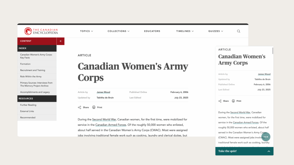
The Canadian Encyclopedia needs to serve a wide variety of user needs, and it excels by delivering a smooth, intuitive experience on both desktop and mobile. On larger screens, the interface can support deep research with a side panel including an index menu and further resources that help users explore complex subjects in depth. On mobile, that same content is reorganized into clean, readable sections with clear headings and vertical stacking so users can browse efficiently on the go. Search remains prominent and fast, articles load instantly, and features like image zooming and simple navigation help mobile users get just as much value as desktop readers.
Responsive Web Design in 2025
Responsive design has moved far beyond adapting to screen sizes. In 2025, it means creating systems that scale effortlessly and deliver consistent, inclusive experiences. Whether it’s a digital exhibit, a donor platform, or a publication archive, modern responsive design ensures your users can engage regardless of how or where they browse.
Responsive web design is not a trend. It’s a baseline expectation. As the web continues to evolve, organizations that adopt flexible, modern design systems will deliver the best experiences for every user.