Web Design Best Practices | A Guide for Your Website Redesign
Author
Stephanie Beasse
Date
July 22, 2021

A lot goes into building a website! It can be overwhelming to keep track of everything, especially if it’s your first time overseeing a website redesign.
One thing to keep in mind is that your website is more than just your organisation’s visuals. A visually pleasing website is important of course, but branding standards aren’t the only thing that will shape your site. You also need to think about the navigation, the behind-the-scenes coding, as well as your overall business goals, in order to be successful.
Below, we’ve outlined some of the key web design considerations for an appealing and functional website. Whether you’re building a website yourself using pre-built templates or working with a web design agency, these are some of the basic practices that you should be aware of before starting a redesign.
- Branding Standards – the design elements that define your brand and attract your target audience.
- Navigation Standards – the principles that affect how users navigate your site and improve your users experience.
- Coding Standards – the standards that ensure your website runs smoothly and efficiently on all devices.
1. Branding Standards
This is where the importance of visuals comes into play for your website. You want your website to represent your brand and remain consistent. There are a lot of elements that go into the branding of your website, even the voice and tone of your content need to flow across your site.
Colour Palette
Your colour palette will be a quintessential part of your design. Having a consistent palette is the easiest way to build your brand’s recognition. Not only that, colours can convey different emotions, align with different age groups, and represent different time periods.
Your brand colours should be based on:
- your target audience &
- how you want to be perceived.
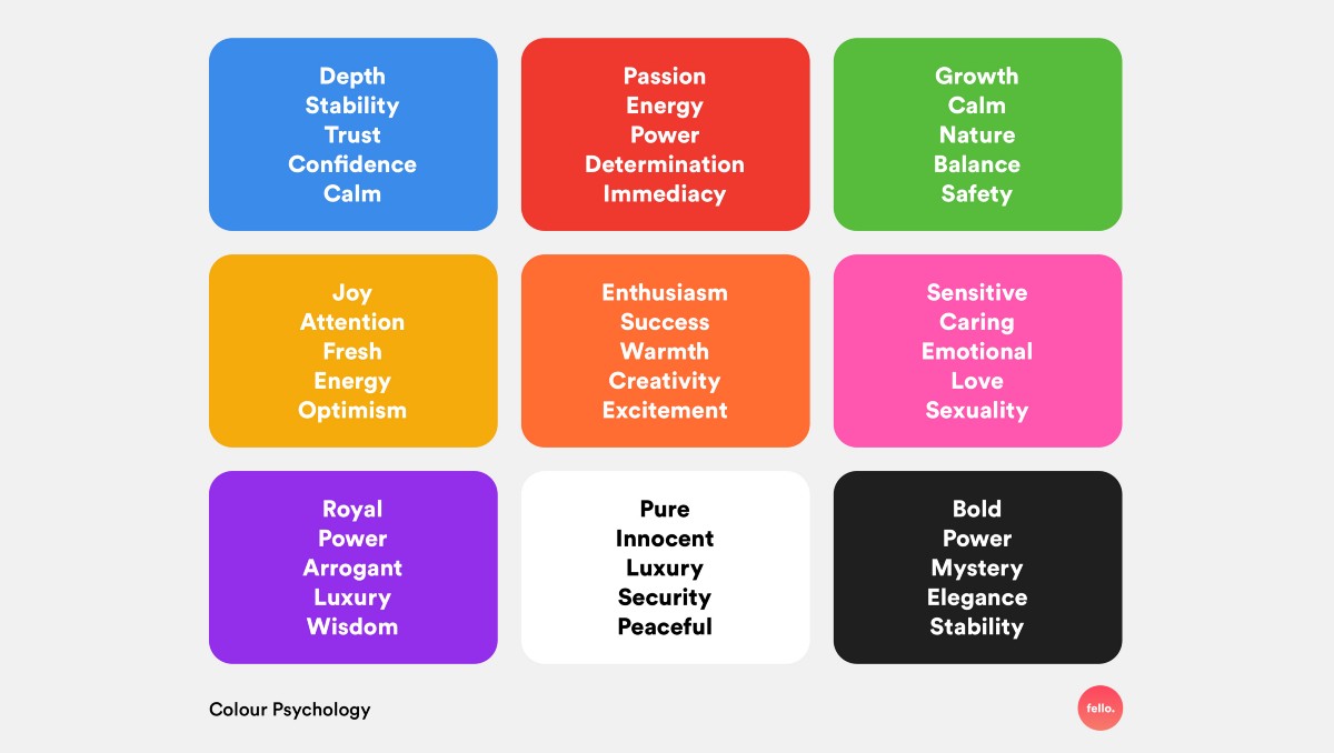
Generally, banks and tech companies will implement blue colours to convey trust, loyalty and stability. Think BMO, Dell, or Facebook. Bolder colours like red convey emotions of passion, power, and excitement. Think YouTube, Red Bull, or Virgin Mobile.
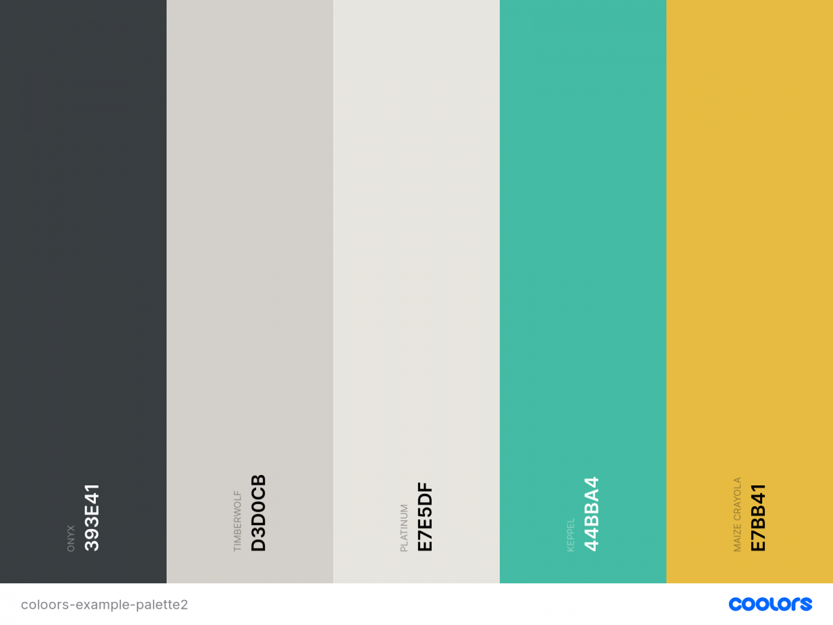
There are endless colour combinations you could develop, but choosing a maximum of 3 colours is the standard. Some brands will go with a complementary colour or two. Others like Youtube only have one primary colour along with shades of black and white. We usually recommend using at least one contrasting and one harmonious colour to build your brand.
Primary Colour – You’ll want to pick your main colour, the one that truly represents your brand. If you already have an established brand, you most likely already have a primary brand colour. When it comes to the web, your primary colour might have to be adapted slightly to be fit for a screen. For example, bold colours that work well on print materials might be too harsh for a screen, causing discomfort for your users.
Contrasting Colour – A contrasting colour will make design elements such as icons, buttons, and illustrations stand out. It’s also necessary when complying with accessibility standards. Those with visual impairments need a certain level of contrast to perceive your text and images. This includes all parts of your website like your menu, headers, and footers.
The Coolors free Color Contrast Checker is a great option to see if your colours comply with the Web Content Accessibility Guidelines (WCAG).
Harmonious Colour – Another colour you should include is a harmonious colour. Normally this means that it sits either next to or very close to your primary colour on the colour wheel. A popular colour palette includes analogous colours, which are three colours that are side by side on the colour wheel. These types of colour combinations are great for icons, illustrations, or infographics as they are super appealing to the eye.
If you want to visualise your perfect colour palette try using Coolors, an amazing free tool you can use for inspiration and palette creation.
Typography
Your website fonts are another key part of your branding. Now that digital marketing is a must in every company’s marketing strategy, typography plays an important role in building your online brand.
Different types of typefaces will shape how individuals see your brand. Here’s a breakdown of the main font types.
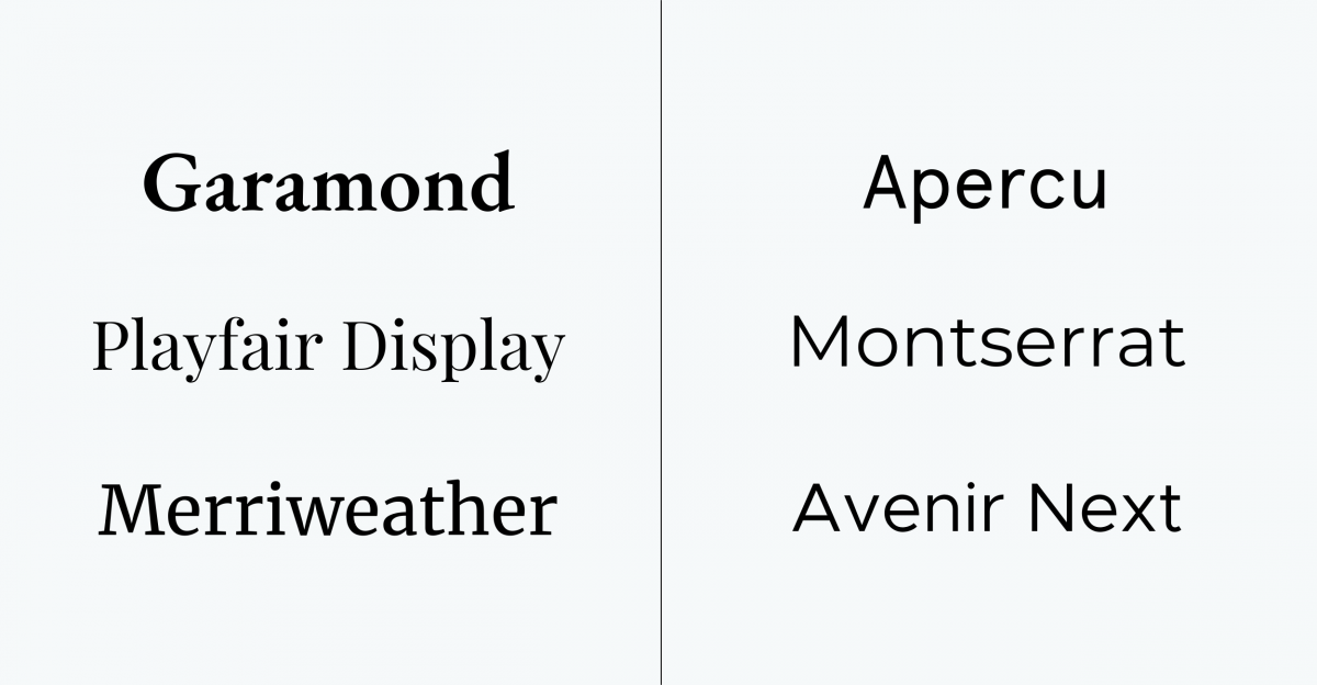
Serif – these fonts contain serifs, which are small strokes added onto a character. This typeface is usually described as elegant, authoritative, trustworthy and traditional.
Some of our favourites:
- Garamond
- Playfair Display
- Merriweather
Sans-serif – these fonts do not contain serifs, hence the name. This typeface is seen as modern, friendly, and youthful.
Some of our favourites:
- Apercu
- Montserrat
- Avenir Next
Script – also known as cursive, these fonts look like cursive handwriting. This font is best used as a title.
Display – the quirky sibling of the group, these fonts have no discernible similarities as they come in many different shapes and styles. They are mostly inspired by calligraphy and are best used in titles.
For script and display fonts, we usually avoid them even for titles, because they’ll look great on desktop when they’re big, but might cause legibility issues when they’re displayed on a smaller screen on mobile.
When you are choosing your font, you have to remember that it represents your brand. If you’re selling a lifestyle product to Millennials or Gen Z then you should consider using a sans-serif font. If you’re trying to appear trustworthy, professional or elegant perhaps a serif font is more appropriate.
Brands like Google and Apple exclusively use sans serif. Their brands are both seen as modern, youthful, and fresh.
While brands like Dior and Armani use serif fonts for their logo and headings to convey elegance and class.
Design Elements
Design elements are an aspect of web design that goes through never-ending waves of fads and trends. But it’s also where you can be your most creative!
The design elements of your website are what add depth and personality to your site. Think illustrations, animations, photos, and icons. You need to choose and develop your website’s style along with your brand. Is your site playful? Is it more serious? Every company has a brand personality and the design elements you choose will play a very important role in properly conveying it.
Since design trends are always changing and evolving, let’s go over some of the different types of elements you can incorporate into your website.
Animations – the poster child for trendy websites! Animations are extremely impressive and for a good reason. They have an interactive element that catches the user’s attention and leaves them with a lasting impression, but only if it’s done well. The animation issues begin when designers go overboard. You don’t want to throw all accessibility standards out the window just for a first impression. You want your users to come back and come back often. Users are looking for information so if your animations make it difficult to get to the good stuff, that’s counterproductive to your goals.
Apple is extremely good at incorporating effortless animations that bring the focus to their products without overwhelming the user or making it difficult to navigate the site. Scroll through to see how they animated the AirPods Max.

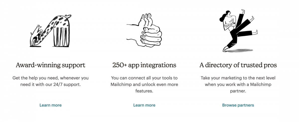
Illustrations – illustrations are a great way to make your website unique. A great addition to any website, it can convey your brand message and mission creatively. Playful illustrations are used frequently by SaaS companies like Hubspot and Mailchimp. A lot of organisations also like combining photos of people with illustrations to create a dynamic and personable site.
Photos – as the saying goes, a picture is worth a thousand words. Including images on your website can provide so many benefits. They can add context to your service/product, convey certain emotions, and better attract your target audience.
And did you know that including photos of people on your website can actually increase your conversion rate? Studies have shown that putting people on your site makes it more trustworthy. Individuals want to connect with others so no matter your organisations purpose, adding a human element will lead to higher conversions.
Hero Image
Your hero image is the first thing that people see when visiting your website, so it needs to be visually appealing and informative to keep them scrolling. Whether it’s an image, illustration, or video, it needs to represent your brand while also enticing visitors with a concise message.
Most hero sections contain a hero image, a title or message, and a call-to-action (CTA). Here are some standard rules to follow when creating your hero image:
Pick an image that represents your organisation – think about what drives your organisation and choose an image that accurately represents your brand. If you’re a theatre, you would pick imagery from your shows that feature actors in action. If you’re a non-profit, you would choose images that support your mission. Your imagery must be eye-catching because it will be a visitor’s first impression. If possible, avoid generic placeholder images and instead invest in your own images.
Avoid text on images – with responsive design, it becomes tricky to avoid your text shifting in an unappealing way. If you feature people in your hero image, you could end up with text covering someone’s face.
Avoid images that don’t leave room for cropping – make sure that the focal elements of your image are in the centre because when they are adapted to different screens the sides might get cropped. This happens often with group shots where without correct formatting, people will get cut off.
Choose high-quality images – to ensure that your image remains crisp and sharp at all sizes, make sure that you upload high-definition images.
Mute videos by default – if you want to include a video make sure that it’s muted when visitors enter your page. It’s bad practice to have your videos autoplay with sound.
2. Navigation Standards
Navigation standards are the elements of your site that users expect or are familiar with. It can be concepts like having a search bar in the header, a logo that brings users to the home page, or contact information in the footer. There are certain actions that users have grown accustomed to and changing them could negatively affect their site experience.
Some of these standards your users may not necessarily be conscious of – such as whitespace or reaction times – while others – like the aforementioned search bar – are more obvious.
Whitespace
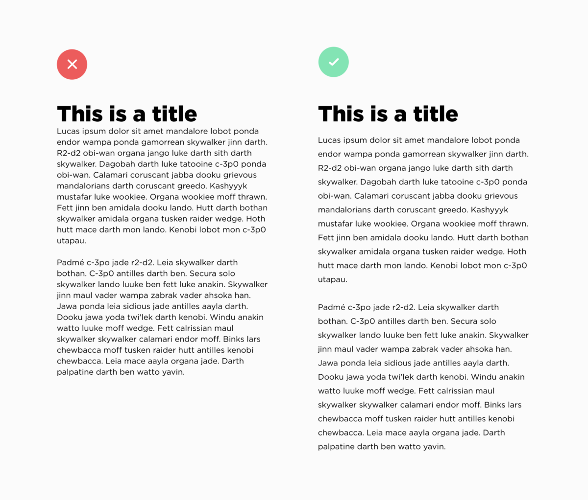
Whitespace is defined as the negative space between elements on a screen. Your text must be readable while also establishing priorities.
When your content is too close together users might miss important information or they might get overwhelmed. When your line spacing isn’t large enough your text becomes harder to read causing users to get frustrated.
Whitespace also helps users group elements together. They can then decipher which information to focus on and what’s considered secondary information. It can also lead to more conversion on your website because whitespace can be used to highlight your call-to-action.
Content Strategy
A content strategy is the planning, development and distribution of your site’s content. One of the most important aspects of a user’s experience is the information they receive, so it’s important to have a structured plan in place.
A common practice for modern web design is using a content-first design approach. Stemming from responsive web design, content-first uses your content strategy to guide the layout and design of your site rather than the other way around. Without properly planning your content, you could be missing important context that affects your user journey.
RELATED: 5 Elements of Responsive Web Design
Your content strategy is developed by creating a content priority guide, which is a guide that lists all the content that will be on your website. And I mean everything from buttons to terms & conditions. Your content is organised by level of importance specifically for a mobile screen. This is done without any layout specifications. The level of priority is determined by user needs and goals.
The benefits of using this method for your content strategy are clearly defined website goals and a better understanding of your users.
Menu Navigation
Your menu navigation is the first place visitors will look to find valuable information about your company and services. This is why your menu must be simple and predictable. Your menu isn’t the place to show off your creativity. You want your users to find information quickly so they stay on your website longer.
When it comes to navigating a menu, users have certain expectations built over years of visiting hundreds of websites.
Some standard practices across all menus are:
Logo on the left side – this has become such a standard practice that users also rely only on the logo to go back to the home page.
Search bar on the right side – not every single site requires a search bar, however, if needed it’s almost always on the right side.
Indication of current landing page – users should always know what page they are viewing which can be done by highlighting the menu item.
Interactive menu links – menu links should be clearly clickable by making the text change as you hover over them.
Another perspective to consider when redesigning a website are users on a mobile device. A standard for menus on mobile is the hamburger menu. It’s an icon used to represent a vertical menu that is suitable for any mobile device. It’s perfect because you can click on it to view or close the menu, saving precious space when navigating on a small screen.
Other mobile considerations include a “sticky” menu that follows users as they scroll down a page so they avoid having to scroll all the way to the top to access another page. An alternative is the “return to top” arrow icon which accomplishes the same thing.
3. Coding Standards
We’ve covered design and user experience, but another huge part of web design is all the work that happens behind the scenes. Frontend and backend developers follow a set of standards and guidelines created by the World Wide Web Consortium (W3C) to build rich interactive websites that perform on all devices. Some of these standards include:
Responsive Design

Responsive design, created around 2010, is what enables developers to create applications and websites that can be viewed on any device from mobile to desktop. Now websites are even adaptable to screens inside cars!
Before responsive design was invented, designers and developers would create mobile subdomains, essentially separate applications created specifically for mobile devices. This method worked well because these subdomains would load faster and use less data. But over time, with the ever-increasing number of devices, it became more and more of a hassle.
Now with individuals using everything from their watch to their refrigerator to access the web, responsive design is the best approach to provide a quality experience regardless of the device.
Not only that, there are additional benefits to responsive design including:
Increased conversions rates – 57% of users say they won’t recommend a business that has a poorly designed website on mobile devices. This just goes to show that having a site that looks good no matter the device is crucial to converting your users. The more engaging and well-designed your website is on mobile, the more likely your users will stay on your page.
Decreased development cost & time – since a responsive website’s code is adapted to a multitude of devices, it requires less time from developers compared to the traditional approach. It is also easier for site administrators since they don’t have to worry about how content will be displayed on mobile.
Improved SEO – responsive design by nature will increase a page’s loading speed, lower bounce rates, and improve site usability, which altogether will lead to better page ranking on search engines.
Accessibility

Site accessibility has become a standard in web design because of the importance of accessible information. Every individual has the right to information regardless of their disability, location, or hardware. In fact, the more accessible your site is, the better its overall user experience.
The W3C started a Web Accessibility Initiative (WAI) that brings together industry professionals, disability organisations, governments, and research labs that build the Web Content Accessible Guidelines (WCAG). These guidelines, which are constantly being updated, help individuals use the web to their full potential. It provides standards for every part of the web design process from the creative design to backend requirements.
If you’d like to learn more about web accessibility and how you can create a more accessible website, read our blog post outlining 12 tips for publishing inclusive content.
Security
Another important set of standards that organisations need to consider is the security of their website. Cybersecurity is becoming a bigger industry as companies try to maximise their online security and protect their data. Not surprisingly, the industry is expected to grow by 10.9% by 2028.
Taking website security seriously isn’t reserved for large corporations, cyber-attacks can happen to companies large and small! That’s why you should stay up to date on all the current security precautions.
To learn more about how you can protect your website, read this blog post about Security Measures for Your Website.
Final Thoughts
A successful website redesign encapsulates so much more than visual appeal. Good design is also about how a user navigates your website and how well it performs. With branding, navigating, and coding standards in mind, you will be able to build a website that you’re proud of.
It’s important to note that the practices that we outline in this post are a non-comprehensive list that serves as an introduction to web design thinking. Based on your company goals and target market, some of these practices might not be suitable for your organisation, and that’s okay! These practices can be adapted and modified depending on your needs.

