Plank’s Brand Refresh & Website Redesign
Author
Stephanie Beasse
Date
March 13, 2023
Hello there! You might notice that things look different around here. For the past year, we have undergone a complete rebranding process including everything from our logo to our website. And we’re so excited to finally introduce it all to you.
For us, a rebrand meant not just a visual change but also a desire to best represent who we are as a company. Over the past (almost) 25 years, Plank’s website and branding have grown and evolved a multitude of times and we knew it was time for another overhaul.
Our Promise
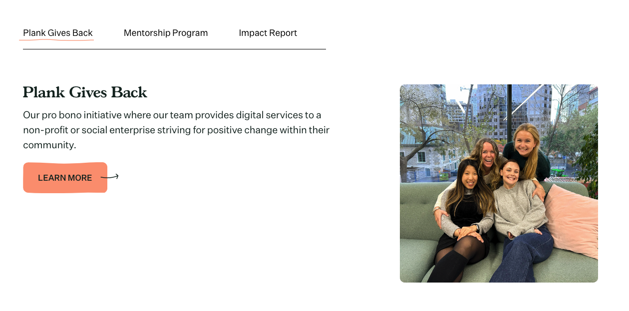
One of the things that inspired our rebrand was looking at our promise to our clients, people, and community as a whole. In the past three years, we have started exciting initiatives including our Mentorship Program and Ethical Web Collective, and we also became a Certified B Corporation! All in all, this led us on the journey to better embody our values, initiatives and people.
We use our business as a force for good by inspiring purpose-driven organizations to join us in making the internet a better space for all.
How do we do it
We bring out the best in our people and partners, by collaboratively building meaningful websites that meet the five pillars of our Ethical Web Design Framework: Accessibility & Inclusion, Privacy & Security, Device-First Design, Development Best Practices & Sustainability, and Environmental Considerations.
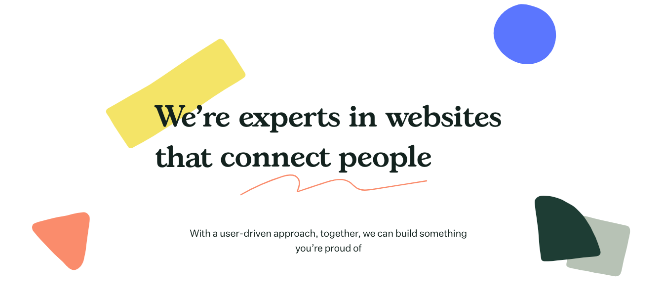
We connect artists to their audiences, citizens to their communities, and information seekers with the answers they need.
To ensure our digital presence was aligned with our mission, we committed to:
- Brand identity workshops
- A brand refresh
- A website redesign
Now let’s look at how it all came together.
Brand Identity
Redefining our brand identity, starting with activities defining our personality, voice, and tone. We held a series of Plank Hack Day Activities where we reviewed our values, client personas, client quotes, and our mission statement to help us describe Plank with five characteristics.
Why Five Characteristics?
In our quest to define who we are, before even beginning the brainstorming of colours and logos, we decided to define Plank using five characteristics to get across the core of Plank accurately. We asked ourselves if Plank were a person how would our community describe them?
Using these characteristics, we could better guide the branding process, understand how we connect with our clients and partners and develop our brand voice and tone.
Who is Plank?
At our core, we build connections through our desire to help and support others. Plank’s story began with one desire: to make the web a better place. We do this by being champions of empathy, compassion, support and trust.
We provide our clients with the needed stability when starting a digital project. We are the partners that provide our expertise while listening to their needs. We let our collaborative and caring spirit guide us in everything that we do.
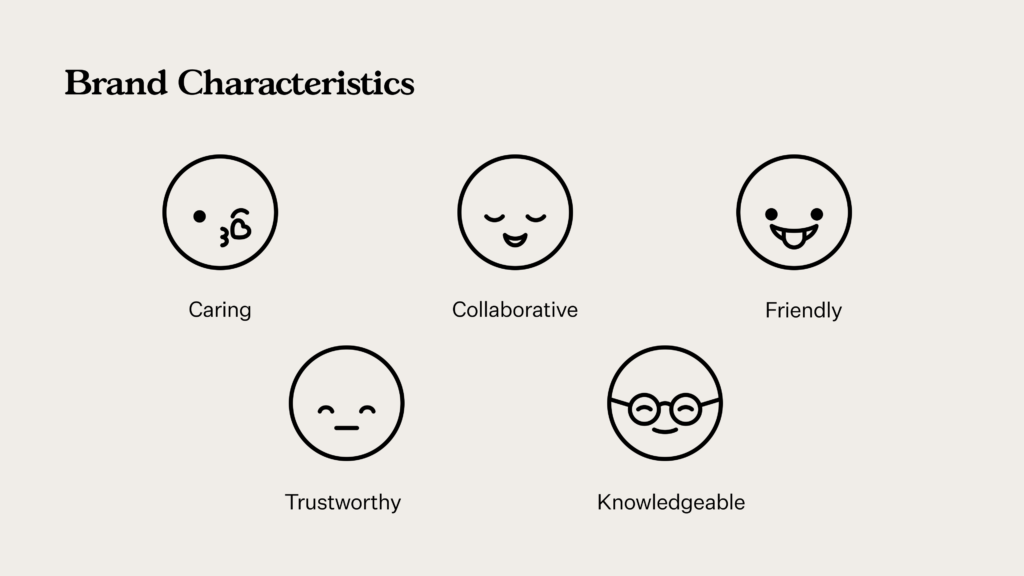
We are:
- Caring – We put our clients & partners at the centre of everything we do. We are committed to solving meaningful problems and making the web a better place.
- Collaborative – We’re active listeners and open-minded. We give our expertise while respecting client needs and opinions.
- Friendly – We’re warm, approachable, and most importantly human.
- Trustworthy – We provide the highest quality work and keep clients updated along the way. If issues arise, we address them head-on.
- Knowledgeable – We’re established experts in web design with over 20 years of experience. We’re successful because of our willingness to learn and innovate.
With these five words as our guide, we jumped into our brand refresh.
Brand Refresh
For our brand refresh, we collaborated with the wonderful Ray Dak Lam, a talented illustrator and graphic designer from Edmonton, Canada. He designed our logo and brand assets and helped us choose our typefaces and a fresh colour palette.
Our Colours
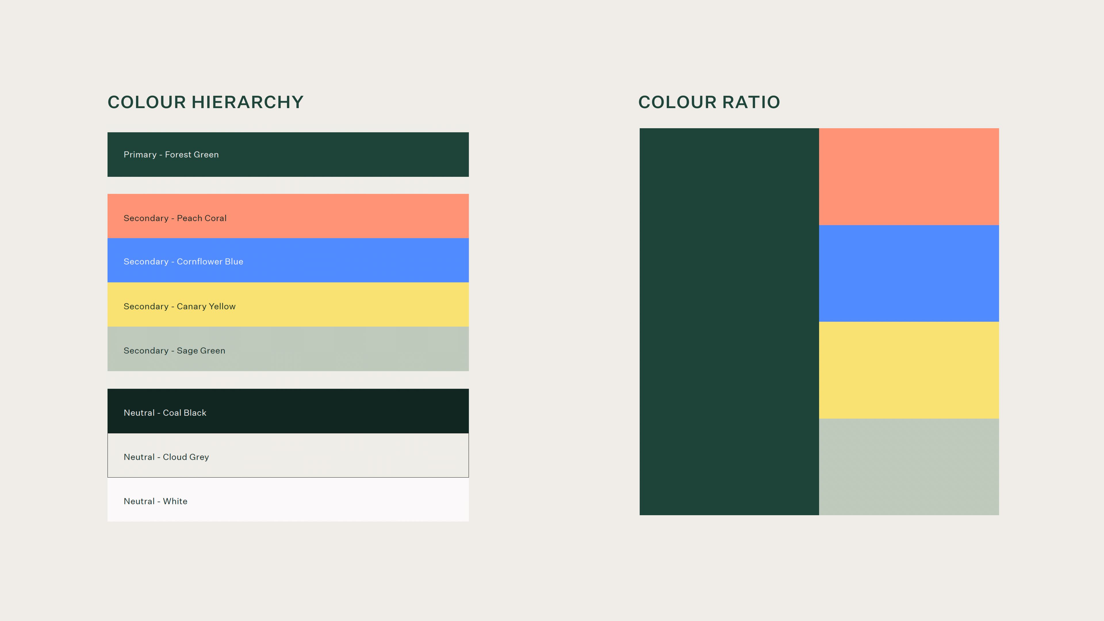
An overall warm, friendly palette, our colours convey balance, compassion, and trust while still being vibrant and fresh.
Our forest green perfectly represents our overall identity as welcoming and trustworthy while paying homage to the natural, organic incarnations of Plank’s previous branding with its prominent leaf and wood elements.
Our secondary palette adds a modern, vibrant, and friendly look and feel, with its warm yellow, zesty coral, and invigorating blue. As a digital agency, these bright colours connect with our community of arts and culture, mission-driven people.
Our neutral colours convey Plank’s balanced, grounded nature underlying all of our core characteristics.
Our Typography
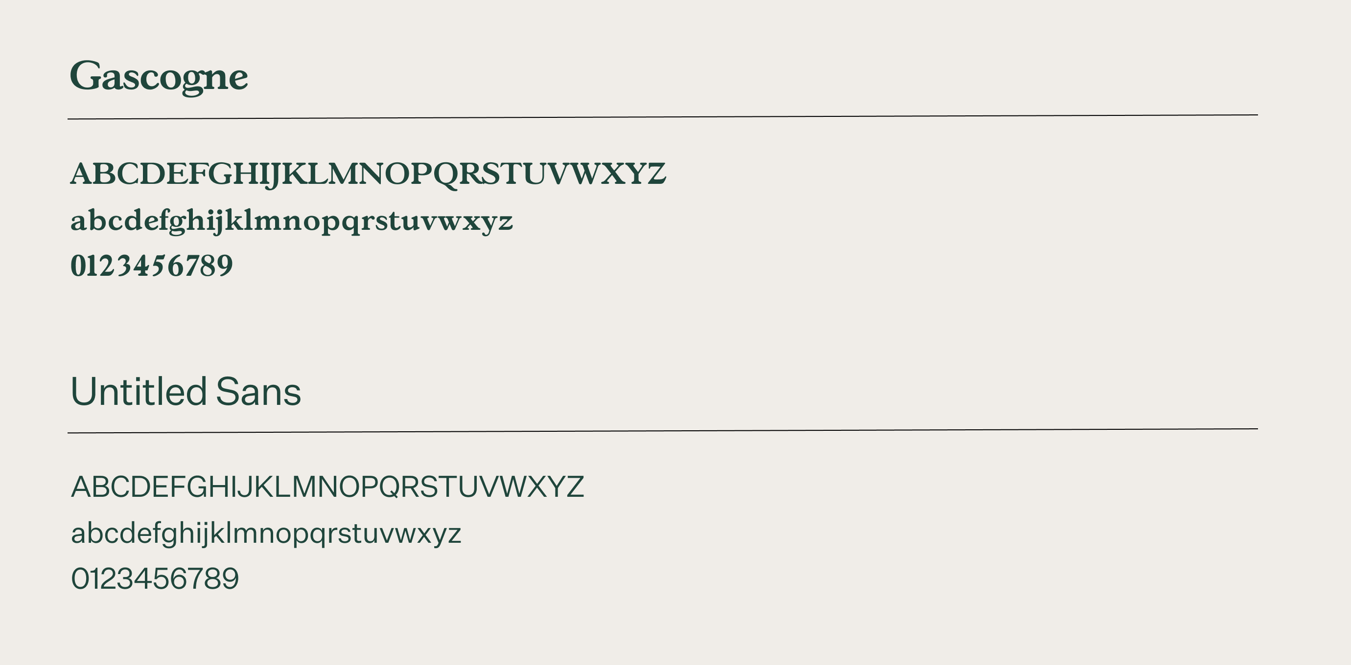
Ray selected Gascogne to serve as our display typeface. It is a rounded serif that feels friendly and approachable while still remaining sophisticated. It is a humanist typeface with forms that reference the stroke of a pen, extending the organic hand-drawn nature of our shapes.
The choice of Untitled Sans typeface for our body text serves as a more neutral sans serif that beautifully compliments the humanist Gascogne with its modern digital feel.
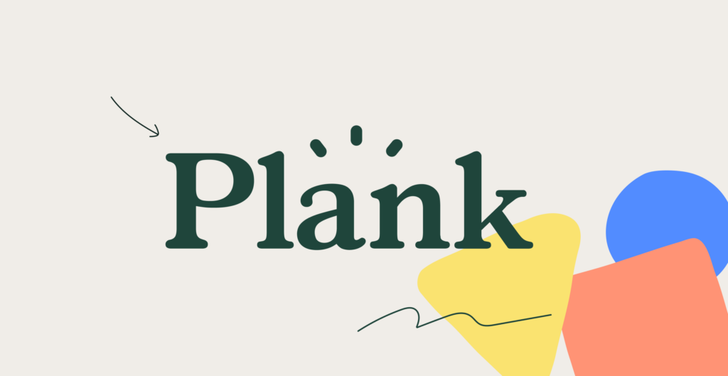
Our Logo
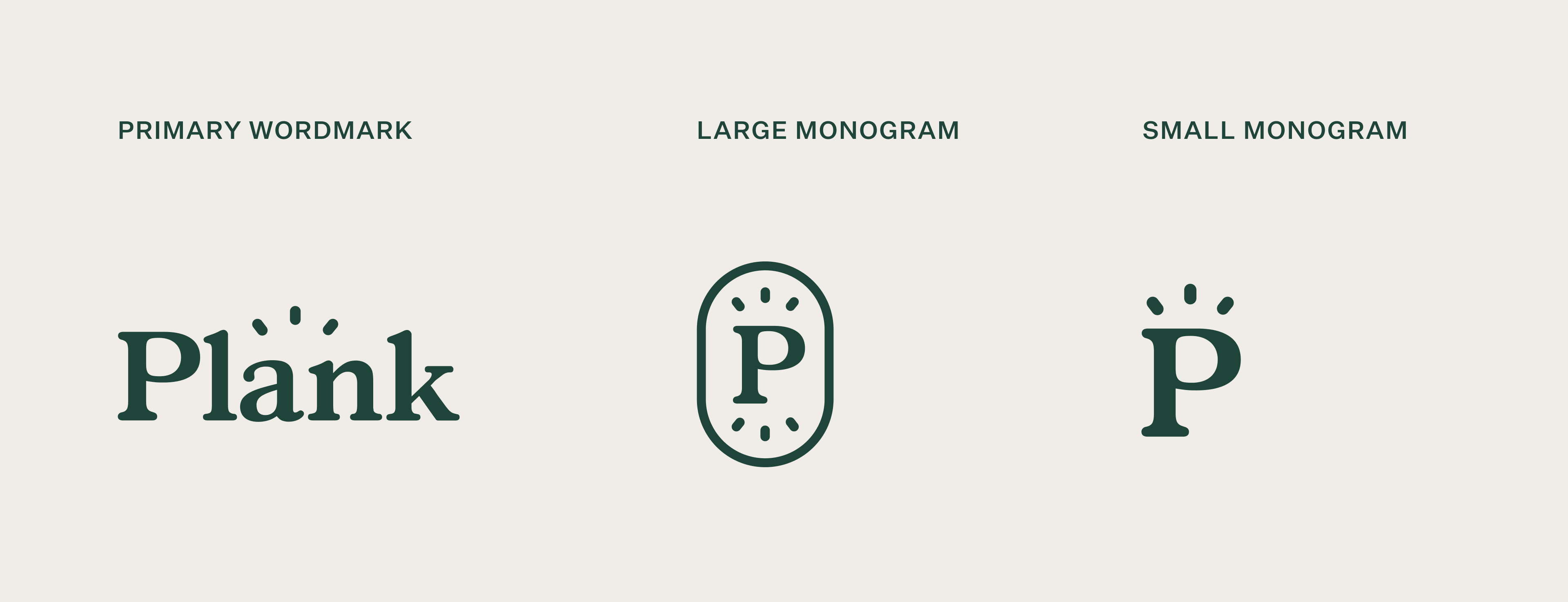
We are in love with our new logo! Ray did a wonderful job of capturing Plank’s personality with bold yet soft qualities. The accent lines above the wordmark evoke our friendly bright nature, vast knowledge, and innovative spirit all at once.
Our Graphic Elements
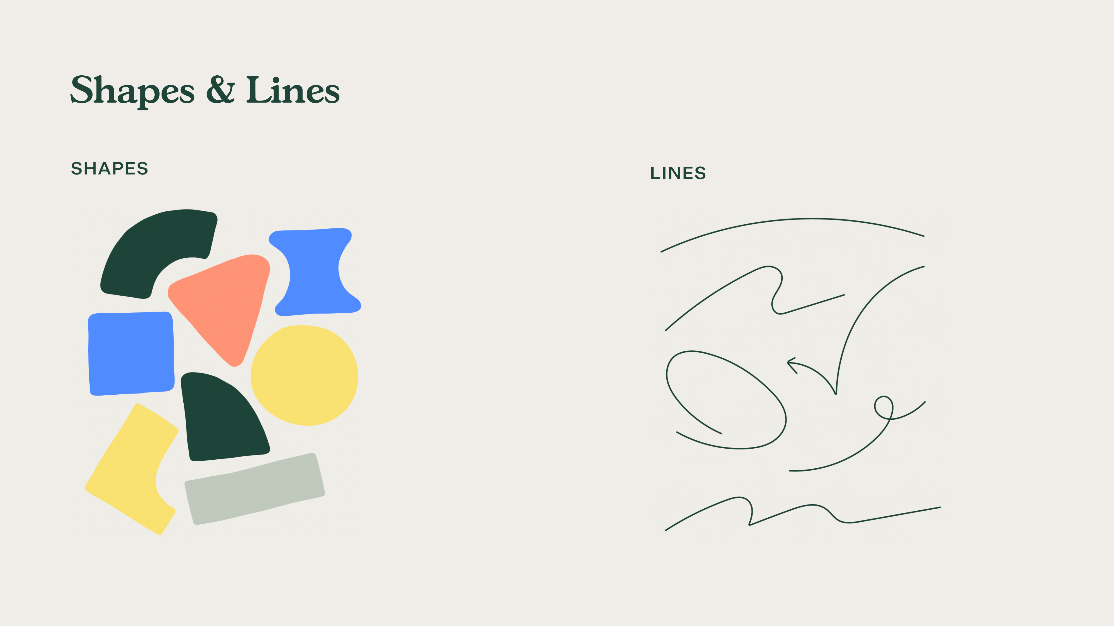
Our graphic elements are an important aspect of how we showcase our energetic and human-centred approach to business. We wanted to make sure these elements could serve as a flexible component system that we could adapt independently and in a variety of ways.
The result is a combination of organic, hand-drawn shapes and dynamic lines that breathe life and personality into our brand.
Website Redesign
Once we established our new brand, the long yet exciting process of making it our own began.
Our main goals with our website were to better showcase our expertise, our team, our initiatives, and our mission.
Animations & Transitions
Giving life to our brand and creating movement throughout our site, we featured a variety of animated buttons, seamless page transitions, and fun animations.
Our creative and frontend teams worked extremely hard to make it all happen and we are super proud of the result.
Culture Page
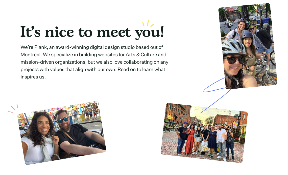
Our previous About page didn’t quite capture all the wonderful initiatives, people, and culture at Plank. We wanted a dedicated page to showcase all the things that we do behind the scenes.
Expertise Page
With over 20 years of experience in web design, we wanted a page to illustrate our vast knowledge as well as how we support our clients. With our Hack Days, Ethical Web Design Framework, and various service offerings, we have a lot to show off!
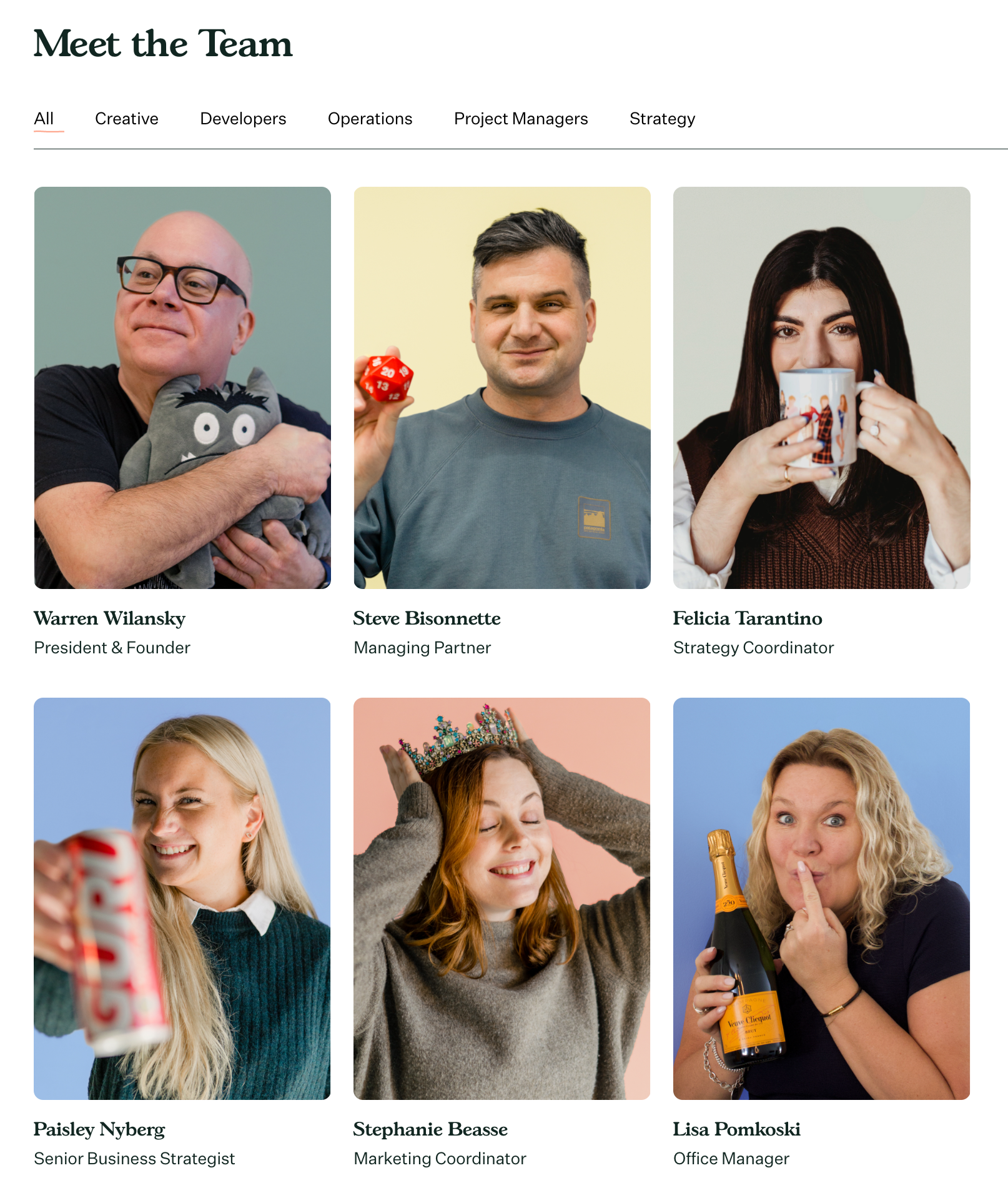
Our People
Our dedicated team is the powerhouse behind Plank! With a lively team, we wanted to showcase them and their unique dispositions.
We hope you enjoy our new website and branding! If you’d like to know more about our process please reach out.